Noob grid question
- Started
- Last post
- 22 Responses
- kalkal
So you can create a grid based layout (talking about print btw) by using phi to subdivide a page but what defines the space between columns and around images?
- monospaced0
There's no hard rule to defining margins and gutters (spaces between columns), and that applies to "using phi to subdivide a page" (whatever that means). The best advice I can give you is to use your eye.
- or just read one of the great books on grids and typographymonospaced
- stewdio0

This book could change your [design] life. While only a chapter or two is dedicated specifically to page grids, the entire thing will resonate with you. Here's more info on it:
http://en.wikipedia.org/wiki/The…And it's available on Amazon of course.
http://www.amazon.com/Elements-T….
And of course, there's Josef Müller-Brockmann
http://en.wikipedia.org/wiki/Jos…and his classic "Raster Systeme"
http://www.amazon.com/Systems-Gr…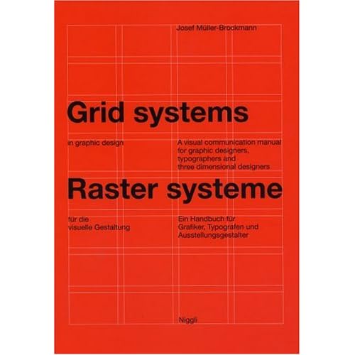
- kalkal0
I wish QBN would remove the clear button, it's so pointless and I just accidentally pressed it after a long post.
Anyway, short response: I'm interested in your suggestions, I've glanced at "Grid Systems in Graphic Design" and "Making and Breaking The Grid" and they don't seem to cover the basics, just look at existing examples. This is nice if you've covered the basics already. I've also gone through a few guides that omitted the info you just gave me.
- If "Grid Systems" is not giving you the info you need, you're not reading it right.Mulatu
- Glanced at as in flipped though, I will go back. Also, knowing that you pretty much eyeball margins and gutters helps a lot.kalkal
- helps a lot, it's not exactly stated anywhere in the book as I see it.kalkal
- That's how I do it. I usually use some sort of simple fraction of the margin and let my type & content define the rest.monospaced
- it's all part of designing the grid... netavive space should form part of your layout,Mulatu
- negative*Mulatu
- doesnotexist0
elements of typographical style is better than grid systems, imo.
there's also another one i like, "The Designer and the Grid"
- kalkal0
Thanks and I'm impressed with the relatively low amount of piss taking for QBN standards. Well done.
- numbers0
"There's no hard rule to defining margins and gutters (spaces between columns), and that applies to "using phi to subdivide a page" (whatever that means). The best advice I can give you is to use your eye."
I have to respectfully disagree. Don't just use your eye, use math.
- kalkal0
I'm interested, how would you go about doing it? (and it's maths, not math)
- numbers0
As stewdio say, check out The Elements of Typographic Style
Chapter 8 - Shaping the Page
Specifically section 8.6 where he talks about creating a modular scale of sizes based on some proportion that works for your project. That's the basic idea, it can be applied any number of ways. But I would never just "wing it" in placing elements, because it gives you the illusion of precision rather than actual precision.
- fresnobob0
I'm a complete proponent of using your eye first, not math, however...
The size of your columns, the margins between them, and image margins should generally be based upon your type size and leading. Your leading is kind of the smallest regular measurement you will see on the page, so use it! I personally like my stuff super even, so I use my leading, as my column margin, but say for example I had 3 even columns, mostly of full text, I wouldn't do this because it would be too even and could make things confusing to read. So, really, it totally depends, which is why you shouldn't just use math! No one is ever going to get down and measure your stuff to make sure it is perfect, especially if it looks like it is perfect.
The Elements of Typographic Style totally has the info you need. Its very easy to find a pdf of it on google...
- alicetheblue0
Typophile has some good points here:
http://typophile.com/node/47265
A tutorial for good typography in InDesign - Setting up a baseline grid
- omg0
grids are supposed to follow the same rules of fight club.
- formed0
Just be consistent and use some kind of a logically approach and you'll be fine.
Tons of resources out there that will save you some brain cells, though.
- kalkal0
ok, aside from the reference material here (especially the very informative video on maths) and http://www.thegridsystem.org/ does anyone have suggestions for anything else related to grid based design?
- kalkal0
Actually, quite a while ago I saw a video with some guy giving a rather long talk on the way he puts together grids. He made a little tool to help himself too and provided it to the public through a little web page.
Anyone remember what I'm talking about? Got the video still?
The guy was on stage with a presentation and everything, wasn't really relevant to me at the time but I remember it being good...
- And there were pretty little trees. No actually, that's the wrong person..kalkal
- monNom0
freshnoob has it right. just eyeball it. If you need to codify things for consistency across multiple pages, bang out your ideal layouts for a few pages, look for the commonality between them and adjust to bring them all into a cohesive grid. The grid is just a guideline, your content should drive layout choice.
I find that when a page is 'working' freestyle, the ratios tend to be near to the golden section or rule of thirds anyways. I think we're hard-wired for natural ratios like that and intuitively produce them in our work. Measuring first seems like it would limit your decision making and stifle creativity.
- kalkal0
I'm all for eye balling but I would also like to learn as much as possible. I know some people have come up with certain processes that help them put together their grids. I just want to soak up as much knowledge on the matter as possible. I don't think grids will all of a sudden make me a superstar designer, as I'm not actually a designer anyway. But I'm interested.
- kalkal0
btw, is my description of the video too vague?
- omg0
Oh saw this, looked interesting