Similar logo
- Started
- Last post
- 15 Responses
- partdeux
I came across this on someones site and immediately thought of another logo that it was similar to. Except the used a skull as one of the icons.
I didn't bookmark the site where I saw the original but do any of you recognize it?
It was on one of those design/inspiration sites like graphic exchange or something.

- organicgrid0
There was a thread about thee types of logo identities on QBN somewhere...
- have the link to the thread?partdeux
- I am trying to think of it.... There is a certain name for that kind of logo...organicgrid
- saltiredmay
- excellent DMAY!organicgrid
- partdeux0
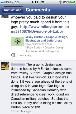
tisk tisk outclass(dot)ca
Sad that people still rip stuff off thinking no one will notice eventualy
- _salisae_0
“Don't try to be original, just try to be good.” —Paul Rand
- says the man who branding one of the worst companies in the world.boat
- you mean the "logo design king" branded a company with bad ethics and that's now his fault?_salisae_
- just trying to be clever and take "just try to be good" out of its original context.boat
- you're trying too hardidentity
- :(boat
- I'm just joshin' with you man! no hard feelings! :-)identity
- ahhh .. that is funny._salisae_
- though the tisk tisk by partdeux is the most humorous part of this thread._salisae_
- identity0
the form is called a 'saltire' it's been used since days of heraldry.
Culturally speaking, this form is everywhere - its not a new idea. Mike Burton didn't invent this but he did a good job with his rendition.
- bulletfactory0
hard core bands have been using this style for years.
- organicgrid0
Nothing that we do and or create is original or innovative...
- i_monk0
It's a rip of the Scottish flag.
- partdeux0
pretty classy response from a "sophisticated" menswear company haha
- bumdrizzle0
just because you saw a logo first doesn't mean it was first. or did you actually check dates before you started emailing accusations?
- letterhead0
Partdeux, this whole X logo configuration was and is a hot trend in recent graphic design. As others have explained it is an age-old heraldic treatment, much like a crest or a shield. Mikey Burton's logo is just one of thousands like it. I would do a little research before crying foul in a public forum, or on twitter or whatever.
- detritus0
haha, which desperate chump thought to send them that accusation?
Good on them for standing up for themselves!
- SHAMAN0
well said letterhead...
- grafiske0
Aside from this thread - there will probably be abbout 7 humans who see BOTH logos in their lifetime.