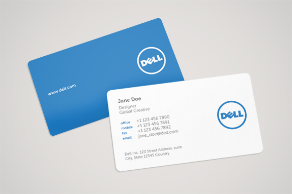
New Dell logo
- Started
- Last post
- 22 Responses
- abettertomorrow0
IBM wannabees
- voiceof0
The purpose here wasn't to make a cool new logo (they has a lot of equity in the old logo). The just wanted to clean up their act and get there branding in order.
from the "brand new" article:
"This implementation is merely the visible result of a process that started in 2007 when Dell announced an initiative to consolidate its more than 800 creative agencies around the world"As someone said above "both of those logos are on my laptop. almost two years old." They had to get there shit straight.
alright enough of my pomposity.
- scarabin0
awesome, now it's gonna look even smaller in print and on devices
- thompson0
anyone have the new dell logo in eps?
- akrok0
even-steven!
- dbloc0
I don't mind it.
- honestIy0
- Surprised Dell use a free font, I spotted it on their ads the other day!robulation
- really, you're surprised? it's dell ffs.CanHasQBN
- neonspice0
are they going to change it back like GAP?
- honestIy0

- ...like add a circle to the logoDodecahedron
- read the article behind the decisionshonestIy
- theres a whole article on how to add a circle to the dell logo?jetSkii
- hellrod0
From the article...
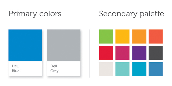
Yes, to most people it's just a blue circle wrapped around the familiar all-caps name and tipsy E, but oh no, it's so much more. For starters, that new blue is a custom shade that you won't find in any conventional color book, now called Dell Blue, and it's seconded by a Dell Gray (fitting for a business-centric operation) and a whole palette of specially selected extra colors. Additionally, the lettering is now a little taller and squarer, with the E extending above and below its brethren by tiny little bits. Oh, and there's an exciting new typeface for the company's slogan -- check it out after the break.
- desmo0
Thats not new.
You had me all in a huff ready to trash another identity redesign! :)
- georgesIII0
why not,
-
to meh or not to meh,
that is the question.