
Logo Crit 2.5 2929 Responses

Last post: 2 years, 6 months ago | Thread started: Nov 17, 10, 3:22 p.m.

RespondNew TopicDisable Images

  • yeeblazer

    Hey guys, hopefully these are improvements -

    Recap: Interior Designer, who is starting her own company

    Original crit/post: http://www.qbn.com/topics/645016…

    http://www.craigeiseledesign.com/VirginaB3.1.jpg

    dig in.

    Nov 17, 10, 3:22 p.m. – Permalink
  • dbloc

    see original critiques.

    • you one tough critic dbloc - i like it, but i need more to take you seriously...yeeblazer
    + add note

    You must be logged in to add a note. Login now or register for an account.

    Cancel
    Dog-earNov 17, 10, 3:25 p.m. – Permalink
  • dbloc

    1. NO
    2. NO
    3. NO

    • now that's constructive criticism for ya!!!!Projectile
    + add note

    You must be logged in to add a note. Login now or register for an account.

    Cancel
    Dog-earNov 17, 10, 3:26 p.m. – Permalink
  • dbloc

    Terrior Design

    http://www.gibdogpetsuppliesblog.com/wp-content/uploads/2009/03/cairn-terrier.jpg

    + add note

    You must be logged in to add a note. Login now or register for an account.

    Cancel
    Dog-earNov 17, 10, 3:27 p.m. – Permalink
  • decisionman

    I think if you work on 1, it could be really strong!

    next note >+ add note

    You must be logged in to add a note. Login now or register for an account.

    Cancel
    Dog-earNov 17, 10, 3:32 p.m. – Permalink
  • bjladams

    I think the top one - but loose the vb and just leave the type.

    • < thishorton1/3
      lose the . and maybe work the dropping Rhorton2/3
      yes, what horton said.heathen3/3
    next note >+ add note

    You must be logged in to add a note. Login now or register for an account.

    Cancel
    Dog-earNov 17, 10, 3:37 p.m. – Permalink
  • horton

    sorry but to be honest i still think you're going about this all wrong.

    ... unless this Virginia B. is a super zany interior designer.

    • gonna see about getting good examples of her work this weekendyeeblazer
    + add note

    You must be logged in to add a note. Login now or register for an account.

    Cancel
    Dog-earNov 17, 10, 3:38 p.m. – Permalink
  • yeeblazer

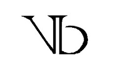
    dbloc - most of the initial critiques fell under three categories:

    Didn't read as VB,
    Didn't look like "interior design"
    Were overworked, overdesigned

    these are what I focused on this round - did I fail? where/how so?

    • your B in VB is lowercase, doesn't match type.. and the V is just losthorton
    + add note

    You must be logged in to add a note. Login now or register for an account.

    Cancel
    Dog-earNov 17, 10, 3:38 p.m. – Permalink
  • VectorMasked

    I don't get interior design from any of those.
    1) reminds me of Prince and some death metal bands.
    2) doesn't work. type and iconography are not working together.
    3) the complete opposite of what interior design is.

    next note >add note

    You must be logged in to add a note. Login now or register for an account.

    Cancel
    Dog-earNov 17, 10, 3:42 p.m. – Permalink
  • akrok

    drop the all caps, in her name. AS ITS HARDER TO READ!

    next note >add note

    You must be logged in to add a note. Login now or register for an account.

    Cancel
    Dog-earNov 17, 10, 3:43 p.m. – Permalink
  • pinkfloyd

    I'm not fond of any of them, but it could be worse I guess

    http://newsimg.bbc.co.uk/media/images/43010000/jpg/_43010835_official_logo.jpg

    • This is incredible. You should stop designing now if you think this is bad.matnz1/3
      How is this good?pinkfloyd2/3
      Its a girl sucking off a guyjasonabc3/3
    next note >+ add note

    You must be logged in to add a note. Login now or register for an account.

    Cancel
    Dog-earNov 17, 10, 3:44 p.m. – Permalink
  • dbloc

    1. Not feeling the icon at all...too rockin for an interior designer
    2. Needs to say Virginia B. The icon is not recognizable enough to substitute.
    3. I see terrior design.

    next note >add note

    You must be logged in to add a note. Login now or register for an account.

    Cancel
    Dog-earNov 17, 10, 3:48 p.m. – Permalink
  • goldieboy

    Who's the market she's aiming at... $$ or $$$$?
    What's her style... classic, modern etc?
    Does she have a website we could look at for some visual ref?

    • website is to come later - she's just getting started.yeeblazer1/4
      and considering the time im having with the logo, i cant wait to have you guys crit that.yeeblazer2/4
      post-up the samples of her work when you get themgoldieboy3/4
      I think you're taking the crit well blazzer... you'll crack it eventuallygoldieboy4/4
    next note >+ add note

    You must be logged in to add a note. Login now or register for an account.

    Cancel
    Dog-earNov 17, 10, 3:49 p.m. – Permalink
  • dbloc

    you really need to figure out her design style before you continue because that's pretty important especially for a designer.

    • gonna focus on that this weekend - wont post again till I have it downyeeblazer
    + add note

    You must be logged in to add a note. Login now or register for an account.

    Cancel
    Dog-earNov 17, 10, 3:49 p.m. – Permalink
  • pinkfloyd

    On the first logo, I don't get a V or a B. The overall shape looks terrible.

    • it's clearly a bird trying to get up off the ground.dbloc1/2
      It looks like he dissected two different letters, and glued them together without any thought of aesthetics or harmony.pinkfloyd2/2
    next note >+ add note

    You must be logged in to add a note. Login now or register for an account.

    Cancel
    Dog-earNov 17, 10, 3:54 p.m. – Permalink
  • pinkfloyd

    I do like the logo on your site though.

    next note >add note

    You must be logged in to add a note. Login now or register for an account.

    Cancel
    Dog-earNov 17, 10, 4:03 p.m. – Permalink
  • watchamakalit

    i don't really like em much..
    but if theres no other choice id go for #3
    and work on tons of revisions.

    one is to emphasize the INTERIOR.

    next note >add note

    You must be logged in to add a note. Login now or register for an account.

    Cancel
    Dog-earNov 17, 10, 6:59 p.m. – Permalink
  • CanHazQBN

    it's great! go with it!

    next note >add note

    You must be logged in to add a note. Login now or register for an account.

    Cancel
    Dog-earNov 17, 10, 8:11 p.m. – Permalink
  • akrok

    did you try my font suggestion? (from your round 2)

    + add note

    You must be logged in to add a note. Login now or register for an account.

    Cancel
    Dog-earNov 17, 10, 8:18 p.m. – Permalink
  • ali

    Not sure if this would suit her style but what if no1 was a more classic serif style like the rough below so it appears like a structural column in the middle

    http://farm2.static.flickr.com/1281/5186624580_386e8a1885_m.jpg

    next note >add note

    You must be logged in to add a note. Login now or register for an account.

    Cancel
    Dog-earNov 17, 10, 9:47 p.m. – Permalink
  • desmo

    You really need to work on your font choice and type setting. All 3 logos seem very mismatched. Again, it seems like you are trying to over design it.

    next note >add note

    You must be logged in to add a note. Login now or register for an account.

    Cancel
    Dog-earNov 17, 10, 9:54 p.m. – Permalink

Login or Register to respond to this

Skip to main content