critique - mrghost
- Started
- Last post
- 27 Responses
- ukit0
I agree with fresnobob, they're not bad aesthetically, but it's lacking any real meaning. Like I dunno...
What's the story that they based their name on about anyway? Why did they pick that name? Is there some theme to the album itself you could riff off of? etc...
- georgesIII0
Stupid question,
but can you rent a lion?
- mrghost0
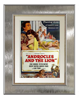
yeah... I'm not crazy about the bands name. just "Androcles" would be stronger maybe?
thanks everyone for the input!!!
I'm going to rework the text, the font, the kerning, and line spacing... and perhaps I can imbue something more meaningful than just colors and textures. I'll post the final product with music in the FMT next week!
- fresnobob0
Not that theyre not pretty, but I don't get anything from any of them. They are all atmosphere and no content, theres nothing to read into.
Also you really need to think about the relationship between lines of type if you are going to break up the name like that. For one, line shit up! Also think about the space between lines and the relationship between that and the letterspacing.
- utopian0
This one

- utopian0
bump
- akrok0
1 or 6.
- hellojeehae0
1
- NONEIS0
The type treatments all feel like afterthoughts – spend some time with the type, and focus less on texture and color.
If #2 and #3 had a baby – it might just work.
- goldieboy0
1