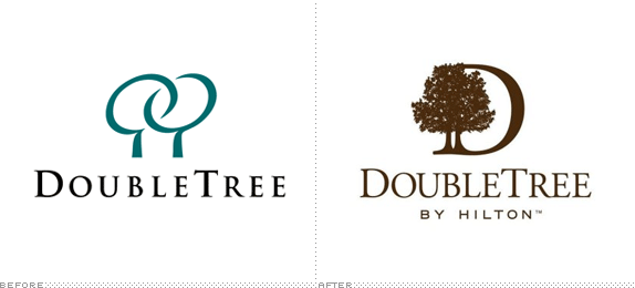
Doubletree
- Started
- Last post
- 19 Responses
- dbloc
Damn! I liked the old logo. WTF!
- dbloc0
Log design is taking a shite right now.
- hellojeehae0
they do need a redesign but... that's not exactly what I was thinking.
- monospaced0
I'm glad to see the "swooshes" go (they were kind of awkward) but the new mark looks really old fashioned, and not as high end as I'd expect.
- dbloc0
I think just cleaning up the old logo would have been a better move.
- OSFA0
To be honest, it looks more like a Bed&Breakfast now.... This is mah version...

See... ;)
- lol
exador1 - i'd stay there now.ephix
- oh shit is this a rip?74LEO
- niceHijoDMaite
- lol
- CygnusZero40
It's starting to look like a TRIPLE TREE!!! What does it mean??
- akrok0
great job! it looks more outdated now.
- 74LEO0
I checked their website their logo hasnt changed are we being crowd sourced again?
- neowe0
lemmings, the lot.
- IRS0

- set0

- Handel0
Kidding aside, the revision is better. Conveys the experience succinctly.
- iCanHasQBN0
Why'd you guys skip over this? It was made between the ones posted.

- stewdio0
I can't say I'm a fan of the new one, but the old one was absolutely gross.
- ADP0
Awful!
- ian0
Well the old one was shite too. The arrangement of the new icon though, says 'Tree Double' not 'Double Tree'.