35 New Hidden Logos of 2010
35 New Hidden Logos of 2010
- Started
- Last post
- 12 Responses
- CALLES0
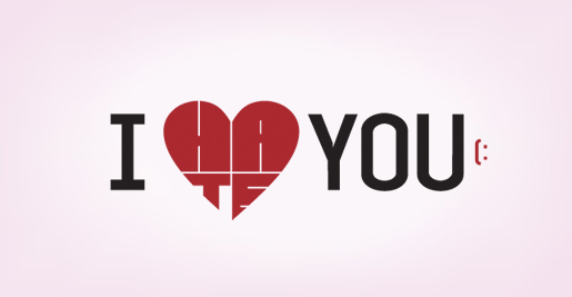
I Hate You:
At first glance it may appear to be "I heart You". But the hidden logo has a different meaning. Amazingly the heart is twisted to spell out “Hate”.
- why is the T in a lighter font?Amicus
- hatebleach©mikotondria3
- ugly execution.iCanHasQBN
- CALLES0
- dope idea using unaltered fonts... very nice :)PonyBoy
- Aye, I don't want to admit it, but that is quite clever.detritus
- Niceduckofrubber
- cleverjmilligan
- toodee0

Fucking greedy horse.- cluster F***kld
- the fuck is this.iCanHasQBN
- the horse ate the dog and the dog ate the cat?randommail
- there's an old lady there somewhere...mikotondria3
- CALLES0
bump
- plash0

oldie but i still love it.
- ESKEMA0
this one is actually very nice.

- Countryman0
these logos suck
- i_monk0
*Every* animal hospital, shelter, and zoo does the nested animal silhouettes thing.