Logo critique
- Started
- Last post
- 62 Responses
- instil_design
Hi, Just making a logo for a friend, For a windows and conservatoires company - Tailored windows. The main idea at the top is using a window frame with measurements as curtains. not sure weather to go with the box shape of the taller more window frame shape. Below was a alternative idea using the same theme but with a house shape. Not as keen on this one myself. ignore the colours for now, Any feedback Pointers appreciated tho :) thanks

- benfal990
i will ignore the colors. because i really hope you will change it.
top one has better potential than the other one i think. maybe i would try more fonts. the window has an old style, like it has been engraved in wood. I would try serif fonts.
- heh yea i will change the colours without a doubt :) thanksinstil_design
- monospaced0
Start simplifying (top one). Big time. The beveled and outlined frame are too much. You could do with half the measuring tape lines also. Less is more in this case. The font choice is questionable and it doesn't really marry well with the mark right now. I do prefer the wide-format window.
- 23kon0
in the 2nd one with houses the ruler lines are too small a detail to see.
not a fan of the first idea with the measurements inside a frame.
i think its actually the frame itself that is overcomplicating things with its bevel and shadow.
just creating a window shape from the ruler marks would work better - logos should be simples!
- bored2death0
I don't see measuring tape... I'm trying to figure out what the negative space shape is supposed to be.
- 23kon0
as mono said "less is more"
- Raniator0
looks like a picture frame, not a window.
- Kidswift0
I agree with monospaced get rid of the beveled edge as it feels more picture frame than window frame. I wouldn't actually get that they are measuring tape line unless explained so in that respect I free it unfortunately fails to deliver your idea. I like the idea in theory but not quite sure you have explored it to its full potential... I would get back to the drawing board and strip it back then repost with a few other workings. Good luck! :D
- set0
i just puked
- benfal990
post the current logo. i want to see it.
- Kidswift0
What about a measuring tape type frame or doorway? Just a off the top thought would clean it up a bunch
- 23kon0

what about something with a frame shape with arrows/spec graphics on it
- What makes you think this would be a logo solution?monospaced
- could be niceshoto_can
- monospaced0
FYI: A logo mark does not have to represent everything about a company in a literal way. Don't be afraid to abstract the idea.
- instil_design0
Thanks for the feedback everyone ill go back and rework from this
- foz0

- foz0
maybe something that's literal could work:

but window shapes have kind of been done: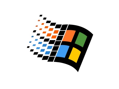
- 23kon0
lol mono. not that ACTUAL graphic.
but something window shaped (square/rectangle) with arrows inside it or reversed out of it .
- monospaced0
I wasn't referring to that actual graphic with my comment, more of the concept, so don't take it personally. I honestly don't think a picture of a window with arrows on it is a solution as it is generic. I think that further abstracting the elements can result in something inspired and visually interesting.
A good example actually is that Windows logo up there. Yeah, like me, a lot of people associate it negatively with the brand and product, but set aside the mark is a successful abstraction of window/digital/dynamic without getting too literal.
- bumdrizzle0
what he is trying to say 23kon is shhhhhhh, adults are talking.
- johndiggity0
you've got a t as the company's initials, which happens to look like part or a window pane. i'd start there. and git rid of that awful type.
