I have no idea
- Started
- Last post
- 15 Responses
- kalkal
ok, I'm not a designer and I'm trying to design a logo, it's a nightmare.
It's for a little business I want to start "distraction photography"
After much hell, I eventually stopped trying to make something that was intelligent, quirky or even smart and went with developing the "dp" from distraction photography.
I've ended up with something thats perhaps a bit too simple.
I went from developing this:

Into this:


But I can't help but think it's not quite "there"
Thoughts?
- kalkal0
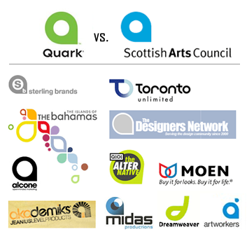
I did notice the resemblance to

After making it and I was happy to live with that one resemblance but that has pretty much damned all my efforts now...
- Jimbo820
Sorry dude, but that shape is massively common, I think every designer has sketched it at some point. Maybe steer away from the dp side of things and think more abstractly around photographic elements, equipment, processes etc etc. Good luck though!
- lukus_W0
Think about concepts first.
Why are you calling your business 'distraction photography'?
- kalkal0
The idea that photos are a distraction?
- kult0
A distraction from what?
- kalkal0
From your current environment, they take you to the past.
My god, this sounds pretentious.
- kalkal0
I'd go with my name but I'd probably end up unknowingly ripping off Marks and Spencer in that case.
- Ruffian0
Not feeling the name at all, go with your name - it's yours.
- i_monk0
It's a bad shape.
- d_rek0
i think the name itself is more interesting than the icon you have developed. As shown it's a pretty ubiquitous and played-out form. My suggestion would be to refine the wordmark further and ditch the shape. If you're insistent on developing an icon try to find some associations to your related profession, the word distraction or some other line of thought completely unexpected.
- 74LEO0
Teh first 3 are nice...
eol.
- camer0
I'm surprised no one has said this yet, but hire a designer?
Anyway, now that that is out of the way :)
It's easy to see that the shape you have chosen is pleasing and easy to like. Look at how it's used everywhere. That said, I like what you've done, colors, shape and all but since it's like a lot of other logos in those respects, you could push it a bit further.That shape reminded me of my old camera with the manual countdown self-timer switch thing next to or on the lens. Maybe you could work in that direction and find a play with time since you mentioned the distraction of taking you away to another time.
- mg330