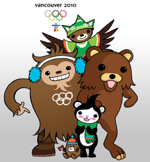
New Vancouver 2010 Logo
New Vancouver 2010 Logo
- Started
- Last post
- 16 Responses
- ********
- Ruffian0
Pedoriffic!
- monNom0
lol, seamless
- jimzyk0
love it. pedolicious
- raskolnikov0
hahah look it's a picture and someone has added pedobear into it – COMEDY GOLD HAHAHAH!
- ismith0
Wow, that's uhh... uhhhh..... holy shit hahaha.
- miesvan0
☃ omg!
- ismith0
Otherwise that thing in the back is a Pokémon.
- ********0
it's an improvement, no?
- Kiggen0
i didn't realize in the beginning
- non0
I think pedobear is smaller.
- Amicus0
This shits all over the Sochi 2014 logo.
- ********0
Why Canadian Design so shitty!
- WOOOOAAAHHHH!!!!
easy... you are ready to condemn an entire nation just by the look of one logo...Meeklo
- WOOOOAAAHHHH!!!!
- inkpink0
highlight on all the eyeballs is from the same lightsource...
this must be a pro job.
- Amicus0
mini pedo doesn't have any light in his/her eyes... :(
- duckofrubber0
http://www.qbn.com/topics/621826…
For posterity!