2016
- Started
- Last post
- 28 Responses
- zaq
Based on the design which city would you pick?

- detritus0
Madrid.J ust 'cos there's something slightly wrong with having a dripping red middle finger.
- freeskihp0
praha, I guess
- nicole_marie0
NOT CHICAGO I DON'T WANT TO DEAL WITH THAT BULLSHIT!
unfortunately i think it is the best logo... but still no no NOOOOO... omg the traffic, the construction i will move or shoot myself now.
- GridGirl120
Madrid
- utopian0
Camden, NJ or Chicago
- identity0
chicago - but nicole_marie is right... I wonder about the city's infrastructure to hold it...
- identity0
chicago - but nicole_marie is right... I wonder about the city's infrastructure to hold it...
- dammitidentity
- yea say goodbye to grant park.nicole_marie
- yes I agree twiceutopian
- hahaha - thank you Utopian :-)identity
- marychain0
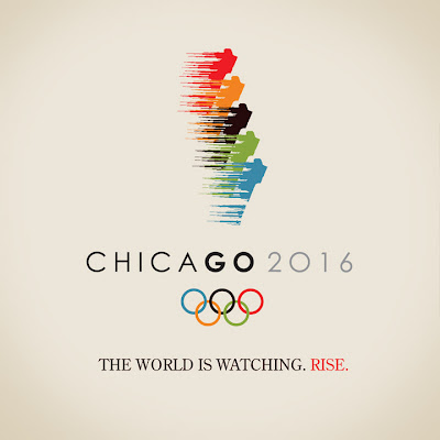
Chicago is the best logo
Rio's is probably second
- zaq0

- I really do not like the "2016" typeface.utopian
- me either. i really like that hand, thoughbaseline_shift
- the hand is very nice indeed.utopian
- the 2026 typeface is gay as hellstyleplus_amillion
- nicole_marie0
so this one got killed?

- Ruffian0
Doesn't the world end in 2012?
- yes that is trueutopian
- they're gonna restart the world for this. But only this.harlequino
- restart the world... LOLstyleplus_amillion
- set0
Definitely Madrid, although I agree about the shitty 2016 typeface
- marcostill0
They're all really bad.
- just out of curiosity what is your favorite logo in general?zaq
- What does that matter?marcostill
- you want to take it outside?zaq
- zaq0

- <--- is that David Carradine?harlequino
- context http://www.robladin.…zaq
- HAhahaHAhAHAHA @ harlequinovsplus
- zaq0
another variation of Madrid logo

- pissfingerGreedo
- I hadn't seen the M in the logo aboveneverblink
- zaq0
- utopian0
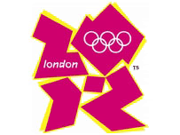
London 2012 "more gooder"
- zaq0
