logo crit
- Started
- Last post
- 38 Responses
- josh_f
any suggestion to improve? thanks cheers
<a href="http://s264.photobucket.com/albums/ii185/memphis_pic/?action=view&current=4.jpg" ></a>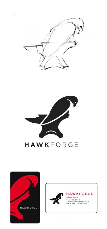
- digdre0
nice.
- dMullins0
I actually like it in sketch form the most. In solid black, the icon is lost too easily to a first-read.
- WeLoveNoise0
- cudnt see it at first thats y i postedWeLoveNoise
- ha thank you :)josh_f
- dirtydesign0
agreed. its coming through better in the sketch.
- kult0
Definitely needs some work. The idea can definitely work, but this lacks a lot of finesse. It looks more like you worked on creating 2 seperate silhouettes then slapped in a boolean divide at the end with that swooshy arc + tangent line.
I'd consider that your base sketch now. Set the layer to 25% opacity, create a new layer, and now recreate the entire form using very clean curves. Make it feel effortless. Right now it feels awkwardly cut together and juxtaposed.
- rzrffglyr0
I like it. Looks more like a hawk in sketch form though. Maybe the upper portion needs to be tweaked - broaden the back, enlarge head a bit, and maybe bring in some of the claws you had in the sketch. The anvil could be extended some more to the right (the tip) so you have an area to rest the claw.
- ceiling_cat0
show the claw more like in the sketch
- dyspl0
mmhhh I'd melt the hawk wing and the left forge.
nice logo anyway.
- transmission0
the end of the anvil seems to suggest the tail of the hawk which makes it look off. the forms are really nice but together they lose something.
Also, did you try the hawks head in an upright position...he looks defeated or sad whith his head hung low.
- mikabast0
i like
- jimbojones0
If the black/red card is the back, drop it, one logo per card is enough. Make the backside just red or black. K F is too tight.
- dbloc0
It's definitely a cool mark, but If I hadn't seen the sketch I wouldn't have known it was an eagle.
- dbloc0
eagles need big claws
- what about hawks? :)baseline_shift
- yeah! and hamsters bathing in blood for srsmikabast
- yea hawks toodbloc
- josh_f0
well he talk about being able to brand it like stamp form into his works of metals. so i have to kinda think if it solid. but i could be on the wrong path with that idea.
thank you guys so far the on the ideas for polishing it up!
- utopian0
really nice logo.
- mydo0
it works better in your sketch because the wing is further down, more balanced. in the vector he's leaning forward and looks like you could push him off. obviously you wouldn't because he's a hawk and would be like all up in your face pecking at your eyes for pushing him off his anvil.
- baseline_shift0
its killing me that the wing ends right on the edge of the anvil. Bring the tip to the center of the anvil, or out side of it.
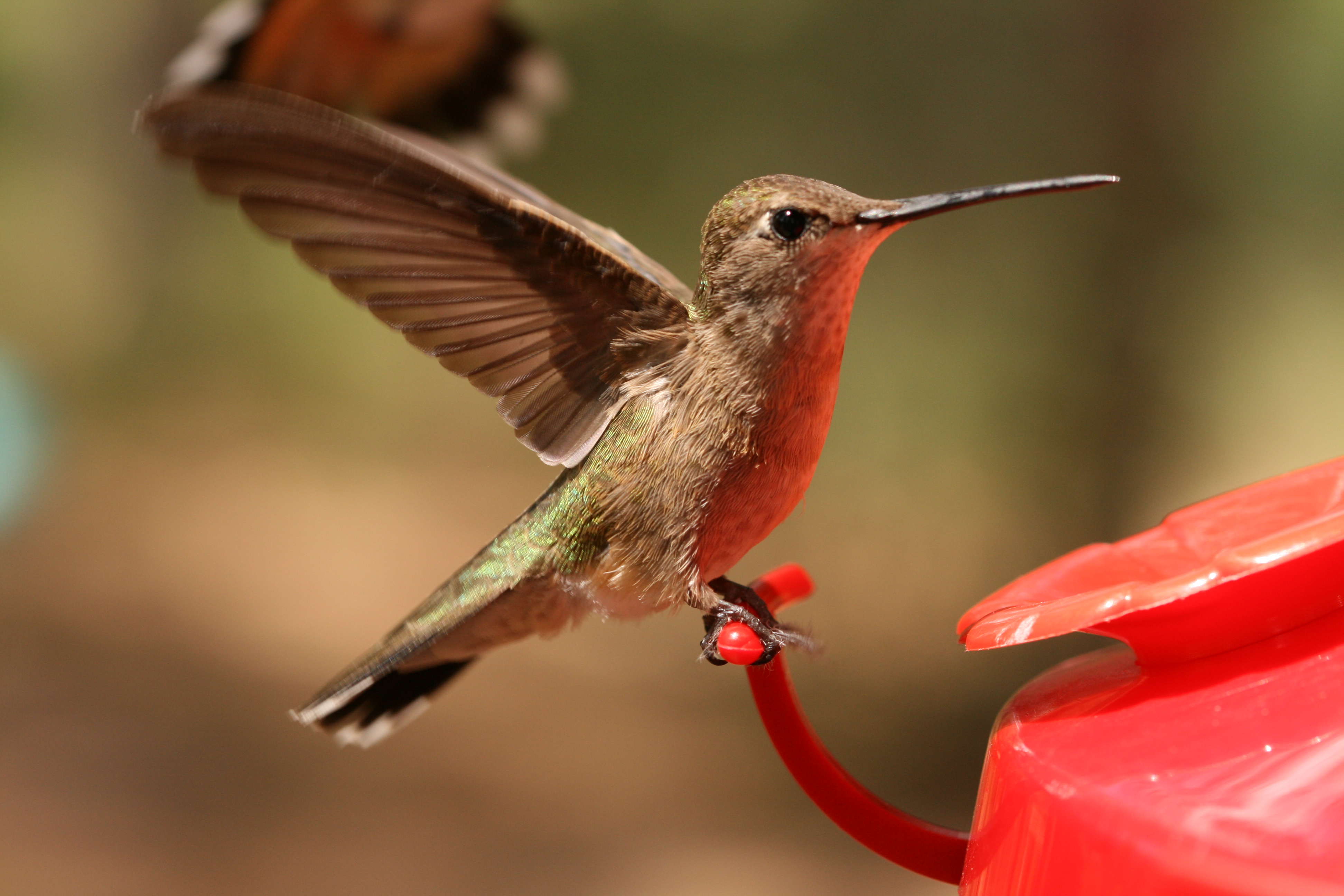
have you tried it with the wings like this:
also, the type should be a bit larger/stronger IMHO
- yes, a hummingbird instead of a Hawk, BINGO!utopian
- haha. yeah, i couldnt find a pic of a hawk with his wings up and back like this. you get the idea.baseline_shift
- tommy likey nice ideajosh_f
- tommy likey nice ideajosh_f

