Packard bell-ends
- Started
- Last post
- 25 Responses
- BaskerviIle
http://www.underconsideration.co…
Aside from a nasty new identity, they released a press release full of BS. so great quotes:
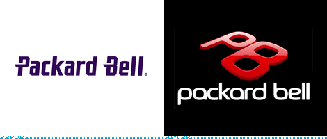
"The Packard Bell brand is where simplicity, trends and technology meets to create fashionably new ways of living and ultra smart forms for working. Across all products and segments, Packard Bell sets the standard for cool, design-driven technology."
"The Packard Bell brand has undergone an incredible makeover that would leave anybody breathless, adapting its visual identity to the brand value proposition deriving from the group’s multi-brand strategy."
"Red is colour at its best. Red is the perfect colour to infuse the Packard Bell brand with the personality and strength of identity to position it as the leader in its particular segment."
hahaha
- stem0
Hahaha, love the BS, it's class
- jamble0
Packard Bell is mega awesome and inspiro-tronic.
- airey0
that's seriously awful?!?! wtf?
- kelpie0
(great thread title)
what a lot of guff they talk, and that logo is one of the easier rebrands to point and laugh at of all the ones we've done so to lately
- shitehawke0
Hyper-global mega-net-tastic!
- fiesta0
great title made me lol
- drgss0
I owned a packard bell computer in the 90s. My dad was playing with it when he was drunk and put a BIOS password, which he later forgot
- harlequino0
"Red is colour at it's best" haha.
I have to use that line some time. There's some top shelf bullshit in here.
- 7point340
... and far of in the distance, the pepsi team over at arnell group collectively sighs in relief
- doesnotexist0
//
yeah red is best... especially when it's on black.
- WrappedInBooks0
Reminds me (loosely) of:

- baseline_shift0
its shiny!!
- felizfeliz0
it looks cheap, geeky, and at home with a spotty 14-year old.
- Jamal_Jenkins0
no way Jose
- stem0
Packard Bell, evolving from sharp to round...
- 7point340
my favorite part is that it's faux 3D, yet done so obviously poorly that i have to wonder why. look at the thickness at the bottom of the B and then again at the top of the P. same thickness. makes the logo look like its been partly steamrolled.
- jimzyk0
its ugly, uninspiring and shapeless.
it will look like a messy blob in a solid black and white form.
best of luck to them and their cunty new logo and arse speaking bollox.it looks a bit like a shitty knuckleduster thing.
god i really hate those shiney bits...
- jimbojones0
oh look, another craptastic rebrand
- krisscott210
Red- color at its best.
Blue- a really shit color
- hans_glib0
i think it's excellent - it really represents what the company is about. Selling useless cheap tat to idiots who'll believe any old rubbish they're told.