London 2012
- Started
- Last post
- 28 Responses
- Miesfan0
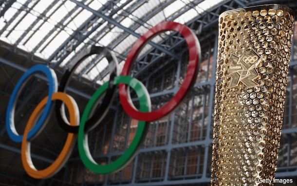
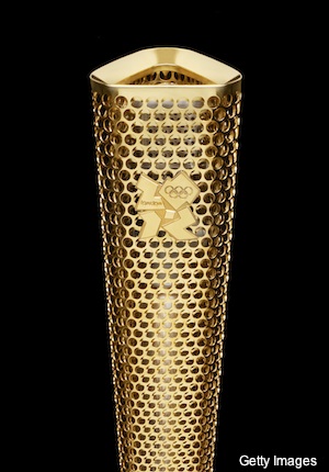
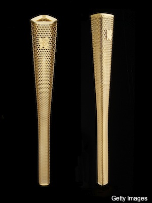
The torch has 80,000 holes. As many as porters.
It will be my next argument to design. Yeah!
- Horp0
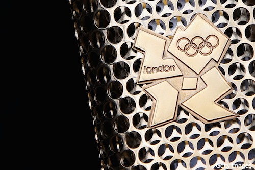
A close up shot shows that the emblem is laid on, presumably just tack welded onto the vuvzela, right at the point of heat radiation. I wonder how long it will take for it to fall off causing appalling burn injuries to the unfortunate carrier.
Imagine spending the rest of your life, literally branded, with that terrible logo embossed backwards in your face.
- Raniator0
2010_vuvuzela.gif
- Projectile0
is this Wolf-Olins trying to be all controversial to get their namke in the papers at our expense again?
- ETM0

- OSFA0
I always liked this one...

- fooler0
looks like they tore apart a cheese grater or mac pro and rattle canned some gold spray paint in it.
- +1 for "rattled canned"i_monk
- -1 to imonk for typing "rattled canned" by mistake.Horp
- divide by 2 for Horp being a turd burglari_monk
- I DID NOT BURGLE YOUR TURD, RETRACT THAT ALLEGATION IMMEDIATELY.Horp
- Are you an industrial designer?IAmMintCondition
- pressplay0
damn, that design already looks dated... and the event hasn‘t even started...
- ETM0
Those responsible for all 2012 design and branding = forever alone.
- but rich as fuckscarabin
- not really... I was at a conference where they spoke about it... and showed POST 2010 work for Adidas, AOL, etc...OSFA
- etc... I got to hear a different angle of this debacle and was impressedOSFA
- or one of the most successful branding companies in england...set
- Not true. As we near 2012, I think it represents that year and the state of the world more and more.IAmMintCondition
- Horp0
Torch looks like a trophy. Innapropriate. It should be milled aluminium, with a screw cap end for the batteries, and an adjustable reflector so you can gradiate from broad beam to focussed beam.
- CALLES0
its just the torch
- Horp0
Trophy looks like a roll of bubblewrap. Horble.
- janne760
it will never happen