critisize this
- Started
- Last post
- 30 Responses
- graficus
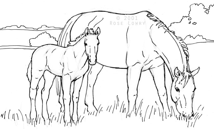
something else i'm working on, constructive shit only please. am image for a vet for your horses.

- graficus0
meant to say "young horses"...
- Juan_Dumplo0
simplify more!
- sikma0
Proportions look off. Torso looks a little small for some reason.
- graficus0
it's a foal, a baby horse, they are like that
- grunttt0
it's a start. definitely has the look of a young horse. The details in the torso looks like you're trying to spell TIT. It looks like you've put it up for a crit way too early.
- graficus0
TIT is the name of the office, glad you got it, at least I'm done with that. please more feedback, this is due very soon.
- drgss0
very bold strokes in the torso vs thin outlining strokes makes no sense
also u can't draw
- graficus0
i know i can't draw, but thanks for the comment, i see what you mean. working on that. more comments plz.
- Complexfruit0
Is this for a logo or an illustration? I would like to see more commitment into the drawing of the line. It seems too wishy washy. And it doesn't seem strong enough as an image. Too many line breaks, and the pose of the horse is too static. It reminds me of a toy horse.
I would suggest researching more logos or illustrations to get a better sense of where to take this.
- graficus0
well, i started with this

it has to go somewhere, and it's a quick project- Is this a for a logo or an illustration?Complexfruit
- that's not my drawinggraficus
- answer the questionComplexfruit
- i thnk she wants a logo, but eventually that should go on the big door of a barn as wellgraficus
- TheBlueOne0
"No sir, I don't like it."
- lambsy0
make it happier.
like this:

- uberdesigner0
not too good
- Complexfruit0
Ok gotcha. Below are some reference images and logos that I like that might help you in designing an animal and figurative based logo.


- take what your client has sketched out as the starting point and not the final productComplexfruit
- hope that helps, good luckComplexfruit
- great reference collection ComplexAmbushstudio
- yes, great collection!uan
- Rushmore0

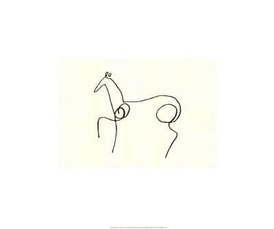
- just wanted to add this Picasso drawing to complex's listRushmore
- Thats cool, not seen that before.Horp
- awesome.coco_ono
- for ones, nice bull. :-)akrokdesign
- johnnyklebitz0
looks more like a troll than a horse.
- NEWSFLASH0
legs a bit long ?
- Scotch_Roman0
TIT? Really?