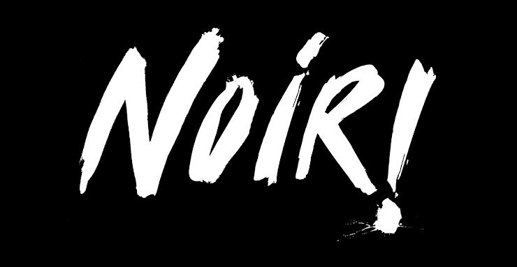
handwritten logos
handwritten logos
- Started
- Last post
- 115 Responses
- set0

- don't think that is handwritten?Jordy
- i don't think so either. but whatever...Antonelli
- No not really, bit like the coke one in that its a script but has nost its hand written feelset
- lost*set
- yeah, just looks like the letterforms were consciously created.Antonelli
- ... as opposed to whipping out a pen and writing it outAntonelli
- When I whip out a pen I consciously create each letter.monospaced
- one would think if you're going for a flowing, unrigid handwritten look you'd just write it out without thinking.Antonelli
- versus thinking about each individual letter as you're writing it.Antonelli
- i think you'd end up with some stiff results if you did.Antonelli
- robulation0
Something I did a while ago...
/Users/Rob/Desktop/Screen shot 2010-12-06 at 10.17.34.png
- set0

searching for the moderna museet logo I found this...
http://web.comhem.se/blam/arkiv/…
- Antonelli0
let's try this again...

- megE0
this is one that i did personally - its not famous, but i like it

- you did this logo???Antonelli
- it's freakin awesome.Antonelli
- yeah that's minemegE
- this is awesome!Krassy
- megE, i had no idea!Antonelli
- what? that i was a decent designer? lolmegE
- well, I've never seen your work before, thats all.Antonelli
- oh ok... gotcha - i'll be in the book!megE
- http://www.c0r0fl0t.… replace the 0s with os - thats my student workmegE
- Meg that's beautiful, well done youkelpie
- good work Meg :)Antonelli
- Krassy0

- created this for my band's logoKrassy
- cool. you could try adjusting the spacing a bit, maybe even overlap some letters (i.e. the 'a' under the 'r', etc)deadfinch
- good call! agreed. thanks for the advice...Krassy
- npdeadfinch
- this was done 10+ years ago - one of the first logotypes i ever tried by handKrassy
- totally see what you mean about the 'r' and the 'a'Krassy
- Miguex0
Hand


- toe_knee0
LOL. Cockhat logo made it into some design blog as a good example of handwritten logo