Options (beta)
- Started
- Last post
- 41 Responses
- stewdio
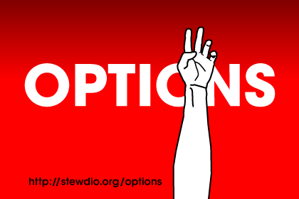
Last month I posted on QBN about the uptick of jumpers from the Brooklyn and Manhattan bridges. (My windows face the East River.) That sat in the back of my mind for a while and to work it out I made this mini site. Can you guys give it a quick look-over and make sure it's functioning correctly? Especially on Windows with IE and FF.
- Stugoo0
very nice man, really good idea,
I cant get it to work on IE7 havent treid ie6. FF3 i can get it to the car exhaust but the dial isnt as smooth as on safari.
- jimbojones0
i feel depressed now...
- baseline_shift0
Works fine for me in everything but IE6.
The images also look a little aliased.This is a little disturbing... But the interactivity is really interesting.
- stewdio0
Inhaling exhaust just takes a bit longer than say . . . shooting yourself. There's some twisted logic to it. As for FF, I was definitely worried about the smoothness of the scrolling. I think it may be the culprit behind an occasional glitch where the gun doesn't fire immediately. So, no go in IE7, but fine in IE6?
- liveforever0
i cnt even slit the thing
- OSFA0
*cuts wrist
Now what?
- stewdio0
@Nairn: I think you're right. More feedback (is it weird to say "encouragement"??) required on the exhaust page. I like the idea of vibrating or something else unexpected from scroll bars.
- Nairn0
My problem was that I'd leave it for, say, '5' seconds, think it not working, then instinctively start revving the engine to get things going, which I guess resets the counter?
Love the pigeon one - the change in axis makes for an interesting surprise! :)
- stewdio0
Ah ok. I definitely need more feedback. The RPM dial tells you how hard the engine is working; roughly how much exhaust you're breathing in. The higher the RPMs the less time it takes to die. As long as the dial is not at zero the screen will eventually fade out, but unless you red-line it the process takes a *very long time.*
- stewdio0

Can I pull some more comments from the QBN mind hive? Too morbid? Needs more "options"? Too easy? Minimal enough?
- Stugoo0
i like it.
morbid. no. I like the simplicity of it, however i feel a bit more feedback would be nice on what your doing, mostly for the exhaust page. I dont feel like im oing anything, part of em would be tempted to say to do it in flash, add sound and a bit more visual feedback. But then i would be tempted to take it so far as to go live action with it thus taking away from how stark and high contrast the images are.would you consider using a simple animation on load?
eg, when the exhaust page fades up, have a hand turning a key?as for more options, how about a head in a noose? knocking side to side to rock yourself from a chair so you slip.
- flavorful0
baaaaaahahahahahaha!
This is great!
- stewdio0
@Stugoo: I briefly considered a noose scenario but was feeling a bit overwhelmed. (How to create the scene in first-person using only scroll bars?) You're right though. A noose is a classic tool for the job. I should definitely cook up a scene for it.
As for adding more feedback to the exhaust, etc. I'm not opposed to adding little tricks and tweaks, but I definitely want to avoid Flash. Part of me was really excited to build an interactive narrative using default scroll bars. It's just so very stripped down :) Creates tight constraints that were fun to play up against.
- fyoucher10
Needs more EMO.
- baseline_shift0
I did think it was pretty morbid. I imagine thats the idea you are trying to push. So it works in context, i suppose, but i imagine its gonna turn people off. Especially that first wrist slitting page.
To be honest, i feel like the illustrations are a little clunky. I think lightening up some of the line weights might help. I also noticed some spots (in some of the fingers, in particular) where it looks like you might have an anchor point to many, and there are wonky little curves. Also, the overlapping of some of the strokes creates awkward line weights.
Also, id love an explanation of what im donating a fiver to.
Compelling project, though. I like the simplicity.
- stewdio0
@baseline_shift: I see what you mean about the wonkiness. I wasn't aiming for awkward so much as brutal. (Like a 2009 version of some of the punk zines I used to trade for in the 90's.) Maybe I can finesse the style without "smoothing" it out. I'm definitely not looking for gloss on this project. (But here gloss is fine: http://stewdio.org/iquit/.)
The $5 donation is to me. Cause I need it. ;)
I know using the razor on the first page is a downer, but it sets the mood right away. The first thing you see is an arm. You think: "Ok. It's an arm." But the second thing you do is scroll down. That's when you get a sinking feeling that "Options" isn't a term of optimism.
I liked that setup too much to not use it as a front page. Also, it helped the slow / fast dynamic: Page 1 is slow. Page 2 is fast. Page 3 is slow. Etc.
- haha! the impression i get is that this is to raise awareness and funds for a bridge jumper program. and you just want beer money.... :Pbaseline_shift
- want beer money... :Pbaseline_shift
- Mau0
fucking lol
