Football Emblems
- Started
- Last post
- 24 Responses
- hitsuji
Random question, but does anyone have any idea of any companies who have designed football team emblems? It's just one of those things you see designed all the time (and sometimes quite badly) but you never know who they're designed by. Only example i know of is Juventus' emblem which was re-designed by Interbrand a few years ago.
- Corvo20
Wouldn't they be done in-house? Most of them are quite old.
- hitsuji0
Not sure? possibly true. I know Liverpool have a company called Liverpoolfc.tv which does their tv channel and website. I went there for a day. I know that Arsenal, Fulham, Aston Villa, Wigan and Chelsea to name a few have had re-designs in recent years
- stem0
Most English football teams crests/logos have evolved over a good few years. All of them have since had a bit of "professional" treatment over the last 20 years or so by all sorts of companies.
Man Utd famously went from this...

To this...

...when they were made a plc.
- never noticed the football club bit had been removedhitsuji
- shit team - shit crestliveforever
- I'm not a fan, but you know that first comment isn't technically true!HAYZ1LLA
- looks like hot dogswrong
- Trashy Man Utd.graphiknature
- hitsuji0
here's a few examples of some more major changes. but yeah they have been modernised, a lot more simplistic these days.
Fulham before and after

Arsenal before and after


Wigan before and after...

- hitsuji0
juventus just modernised their's
from
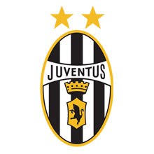
to

- lol at bevel & gradientjimbojones
- better before the re-brand...paulPCcollins
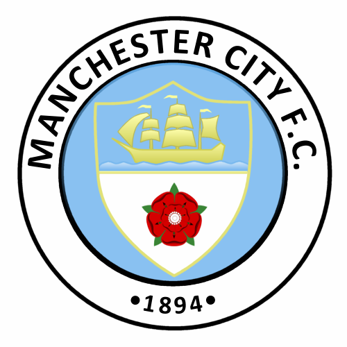
- liveforever0
CITY !!!!!!

- why do man u and man c have the same boat on their crests? They are nowhere near the sea!!!HAYZ1LLA
- Manchester Ship Canalstem
- stem got itliveforever
- HAYZ1LLA0
why do man u and man c have the same boat on their crests? They are nowhere near the sea?
- hitsuji0
something to do with the crest of manchester. but don't ask me what the boat is all about?

oh and this is city's old badge
- stem0
Personally (and liveforever may disagree!!), but Man U should have the right to the boat on the logo as Old Trafford sits on the edge of The Quays?
- yeah it does make more sense. city should have B of the Bang on their's hahahitsuji
- lol tha same B thats being taken down next week ?liveforever
- Alexanda0
What are the 3 stars for on the shitty badge?
- 3 league titles? haha no ideahitsuji
- Relegation???
Only kidding liveforever!!!stem - 1 star for every decade of fuck all! haha, 33 years!DavidNewton
- liveforever0
yeh do i dis-agree - considering city was the original team of manchester :)
- hitsuji0
from wikipedia... "Above the eagle and shield are three stars, which are purely decorative."
- i was crediting them with 3 titles aswell... silly mehitsuji
- lol - we like acting like fairies OK !liveforever
- stem0
Looks like only thing city has won 3 times is the Charity Shield...
http://www.bluemoon-mcfc.co.uk/c…
- hitsuji0
to be fair, it's quite misleading. but i guess it's clever as a selling tool. it suggest success haha. they have a good marketing team.
- hitsuji0
i quite like the new QPR one.
before:

after:

- probably because it's shiny though :Phitsuji
- sucks on so many levelsjimbojones
- I hate the new QPR badge.It's an ugly mess designed on the cheap.mshanman
- hitsuji0
Cardiff City have kind of just gone... "let's cram a dragon and a daffodil in somewhere"

this would look way cool. kind of american though:

- liveforever0
before
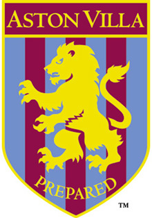
after

- villa only have 1 star - was prob earned beating mcdonalds sunday league squadliveforever
- don't think they need a new badge really. but it's alright i guesshitsuji
- what's with the badly digitised type? A, C totally fucked upjimbojones

