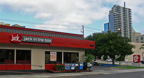
jack in the box redesign
- Started
- Last post
- 66 Responses
- moldero0
I got fatter just reading this thread.
- Frosty_spl0
ohh i like it! But I think the "in the box" feels kinda techie compared with the rest of the look.
- NotByHand0
Duffy's work isn't my favorite... but I've seen worse.
- dskz0
looks like they wanted more emphasis on Jack.
- Peter0
The name is too suggestive. Consider'd a revision?
- mattiaBK0
I like it! +1
- erikjonsson0
ive seen that exact stroke of the c somewhere else. its only a matter of time before someone posts that excact treatment here
- kgvs720
How about a dick in a box?
- Koopsy0
I much prefer the old. It needs some typographic recutting but a rework would have been better than a renew.
- Manitoba0
I like it :)
- monNom0
I don't know what it is, but this totally says "online music downloads" to me.
of course the old one says 'box of salmonella', so could be worse.
- Salarrue0
hahaha
- ninjasavant0
Seems more like a grocery store logo but I don't hate it.
although it does bring this to mind:

- lukusW0

- red + script font + a box .. ut ohlukusW
- noobmonospaced
- yes, i am fairly new around here - pleased to meet u!lukusW
- lukusW0
and