QBN Design Challenge 1 (QDC)
- Started
- Last post
- 49 Responses
- mistermik0
we need more..
- I'll make one..neverblink
- or another brand. bored today.mistermik
- Mau0

- neverblink0
- nice idea but hate the typeliveforever
- I second that, I think a bolder type could actually make this one of the best so farMeeklo
- Detergent.MrT
- jiaf0
I missed the boat on this one (however small the boat was), but I had an hour to kill and I thought It might be fun.

- BaskerviIle0
I think they should keep blue as their colour. Take it back to simple clean logo. I've made the roudel more prominent with the type sitting below. The type colour changes for each varient of the drink (diet, max etc). The can colour reflects the drink type:


very rough and quick but you get the idea (essentially do a coke-style turner duckworth rebrand).
- Juddly0

I realise this may come across as a cop-out, but seriously.
Stay true to your heritage. This is a great logo.(Fun start hey? I'm really thinking outside the box here. Bah.)
- I agree the original was superbset
- +11fernandolins
- yep +1poolio
- I did trim off the square enclosure. Superfluous.Juddly
- yes, we all have a favorite version, but this is an exercise to see what can you come up withMeeklo
- This is a different version. Simplified to essence. I know it's not a 'fun' solution...Juddly
- this is not anywhere near the original, this is the "original"
http://www.x.justing…version3 - which i do think should be used, black on blank silver can
(what else do they have to lose?)version3 - oh common this logo is not great, you only like it because it reminds you of your childhoodinkpink
- Meeklo0
Not entirely convinced about this, but I figure I post first since I started the blog, hopefully will motivate other people to jump on this.
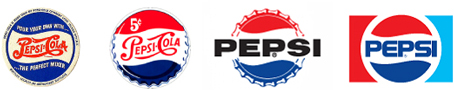
I based this on my favorite version of their logo from 1971.
I don't think its better than that one, but its a start.- oops, I guess it was 1973
http://www.instantsh…Meeklo - We're on the same page ;)Juddly
- I think our general consensus is that we are moving toward less gradient or textured logos..JSK
- But, should we at least try something more modern? Meaning more close to current trends?JSK
- I don't enjoy gradients or plastic wraps, but everything goes.Meeklo
- Yes, no rules, you can change it as much as you want or, stick to something similar. I think some familiar element needs to stay, but if you want to start from scratch go for itMeeklo
- stay present, but if you want to start from scratch go for itMeeklo
- More close to current trends? Fuck that.Juddly
- oops, I guess it was 1973
- skt0


i like the yellow billboards they have done with the new branding... just not the new branding.
- jysta0
Wasn't the original basis of the ID to represent the star spangled banner. I can see it throught the logo's development/ So would add a star to the 'i' :-D
- faintheart0

- you know... I'm not convinced on this one as it is now, but I think you have something there...Meeklo
- It looks like a bubble filled with a liquid..Meeklo
- i did it in 20 min.faintheart
- is that a good thing?Meeklo
- Schnookums0
I would have to invoice you ungodly amounts of money to actively participate in this thread.
- Samush0
liking the idea of QDCs, shame im too lazy and shit to take part.
- janne760
^ up
- Meeklo0
Here is one a bit more out there, but the colors still keep it familiar
- I shouldn't like this, but I do!phatlee
- its like Pepsid AD or whatever that antacid medicine is. :)monkeyshine