Air France Redesign
- Started
- Last post
- 22 Responses
- moamoa
looks a bit unbalanced.. no?

- Horp0
I quite like the letterform but the red thing leave sme cold and reminds me of BA.
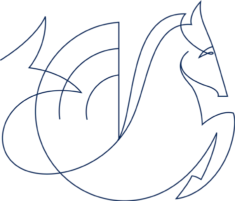
What the merry fuck is that horse thing. Please don't tell me thats live.
- Nairn0
I like the type choice, despite the weight appearing to shift optically through the form - but the graphic detail just kinda floats there, doesn't it? I dunno, I don't really care - though it'll be sad to see the old one go - I rather liked it.
What's with the fucking kelpie horse thing?
- moamoa0

- Oh. I don't think I've ever registered this detail before. Why the association with a flying water horse?Nairn
- Pegasus, aye - I get that. Fast and flying. Gotcha a-ok. But water? That's the last thought I want at 30 thousand feet.Nairn
- I think the horse is a french symbol.... but water? hmmmoamoa
- UNLESS IT'S UN MA BELLUH.Nairn
- LOL ;)moamoa
- I thought the 'wet , fleeing dandy' was France's national symbol?Nairn
- I will google that...moamoa
- i think the cock (rooster) is france's national symbol?poolio
- Oui!miesvan
- moamoa0

- looks alot better
wats the newer typeface ?WeLoveNoise - Not keen on the letter spacing though. Will look bad on airport kiosk signage I bet.Horp
- I prefer the old logo. Type? dunno probably custommoamoa
- Custom variant of Aries if you ask me.Horp
- think this is better
http://img525.images…WeLoveNoise - DELT. The updated mark is ok, tighter spacing would do better though.jimbojones
- looks alot better
- ********0
much better than before.
- moamoa0
I think the R is a bit to wide. and the I R could be a tiny bit closer together.
its ok but dunno something looks wired
- .. why do I caremoamoa
- the R is like falling to the left...jimbojones
- ********0
The horse is crap.
- not reallymonospaced
- the horse is quite cool, but what does it do? a part of the logo, I hope notjimbojones
- typist0
i prefer the old one
- ********0
digdre approves.
- Horp0
"Actually, sack the 'optic' comment - late night, not much sleep - it may be my eyes".
Actually Nairn I was going to say the same but I didn't bother. I think they've tried to give a respectful nod to Excoffon's original top-heavy lettering by making it a bit imbalanced, but Excoffon had some solid optical theory behind his design (ie top of the letters are more important than bottom so we look to those and they move faster as a result) and these chumps just seem to have decided to dick around with stroke weights for fun.
Branding seems to have gone back to 1996 in France. This one and the new Citroen one... eeeeuuuurrghh.
- monospaced0
It feels like the red thing is taking off, which isn't bad. I'm alright with the new illustration too, it's definitely unique.
- jevad0
The kerning is all fucked up
- it's not that badmonospaced
- ?!?! Look at the spacing between the I and R!!jevad
- strong verticals demand more space. you should know thatmonospaced
- too muchjevad
- non0
the "F" is ridiculous.
the "R" is too chunky.I would drop the little red thing and focus on the pegasus. It has more potential than that little red piece of digital tissue.
- neverblink0
the red thing is areference to the french flag.. which is blue-white-red in three vertical beams.. I wish they had somehow encorporated the uplifting motion of the red part in the text as well making it more cohesive.
I like the text, but agree with Moa that the IR could be a tad closer together.
- WeLoveNoise0
think this is a better version

- 90% woukd read DELTmoamoa
- we're not talking about that logo, btw.
and no, your version is not bettermonospaced - whateverWeLoveNoise
- only pissing around cos i'm soooooooo fuckin boredWeLoveNoise
- good steroid logo
DELT UP YOGreedo - i need to stop posting mediocre shitWeLoveNoise
- wow so similar.. what does delt do? and are they aware of delta? :)Meeklo
- attentionspan0
too much space between I R
looks rushed
- no no - monospaced the kerning ninja has decreed it's ok!!jevad
- I R needs to be a bit wider then the rest, but this is to muchmoamoa
- IR is ok, but what's with AI?jimbojones

