design crit thread
design crit thread
- Started
- Last post
- 80 Responses
- ********0


- neue75_bold0
- why pick this over the thousands of things that look exactly like it?********
- where?neue75_bold
- it was easy?neue75_bold
- I do prefer < that to this http://i462.photobuc…neue75_bold
- I prefer this--go figure********
- why pick this over the thousands of things that look exactly like it?
- ********0
bump

- I love it!neue75_bold
- me too. why?********
- it captures how I feel —
my flowery mantra and sunny disposition..neue75_bold - golden showers...********
- Nice!********
- neue75_bold0

- nice focal point!akrokdesign
- the sun is a mass of incandescent gas, a gigantic nuclear furnace...neue75_bold
- it got nice contrast too.akrokdesign
- I like how it costs lots of money to buy the poster.Jaline
- Didn't Kenneth Noland and Malavitch do this?WrappedInBooks
- I'm sure something as pretty as you comes at a high cost too..neue75_bold
- I feel like the circle should not be centered********
- top and bottom, that is********
- I am so bland...Jaline
- http://www.blanka.co…Jaline
- my eyes hurt now.canuck
- perfect********
- I like this********
- akrokdesign0

- cute, very well done..neue75_bold
- I like this. It's pretty funny, clever and well executed. However, I am sick of letters/numbers made from pictures.********
- pictures.********
- Lovely style this********
- NICE********
- akrokdesign0

- um...neue75_bold
- I like this, tells a good story in one imagekelpie
- (plus I've done that)kelpie
- (in case I can't remember who I am while I'm brushing my teeth)kelpie
- sure you have.Jaline
- hah. yeah, the story is told in a sec. great idea.akrokdesign
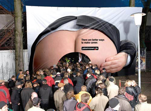
- personally, not a big fan, even if sex sells, it doesn't mean we should keep beating a dead horse.. move along people..neue75_bold
- at least have it be man/man or man/donkey...neue75_bold
- I don't think this is a sex sells thing, I don't think its titillating.kelpie
- but didn't they just have sex?neue75_bold
- maybe you're right... but this doesn't do anything for me...neue75_bold
- fuck you then. no really. fuck you, I hate you.kelpie
- *slams Hkelpie
- at least put some dried vomit on the sheets********
- a bit of wee and blood...neue75_bold
- I doubt this is real. Unless it's in Australia.********
- expand your options for wasting more paper and glue for your stupid life._salisae_
- neue75_bold0

- http://www.a-zlezing…neue75_bold
- shit. straight up awful clichéd overprinted rubbish, wouldn't wipe my arse with it in case I caught somethingkelpie
- is it one of yours?kelpie
- i have one, near my school********
- you came out of nowhere there Tom...neue75_bold
- I guess I feel like things of this order, while possibly technically accomplished, are purely the results of fashion********
- spooked me a little..neue75_bold
- and will go the way of the woodgrain dodo********
- agreed, but that's kinda reflective of the subject matter, innit?neue75_bold
- I mean, deer********
- I guess so...********
- I actually think its quite pretty and I quite like the overprinty craze. dead into condensed type too at the moment. how shallow am I?kelpie
- i mean, i have that poster, and the 'conference' in near my school********
- the only thing that bugs me is the suspicion that many of the practitioners of thi art delude themselves that they've transcended trends are doing purely functional design********
- transcended trends and are doing purely functional design********
- but I guess that's being quite finicky, seeing as I do far worse things********
- but what the hell, it is a "crit" thread********
- i only know mil and cookies********
- I like hearing reactions to details********
- I know what you mean; pure function as trend. we're intellectual so our trends aren't trendskelpie
- interesting overlay of assymetrical and symmetrical********
- I, for one, wish I could formulate such an astute opinion...neue75_bold
- I also pretty much only believe in function, especially given that it's a conference, doing anything else might resultneue75_bold
- in a political nightmare..neue75_bold
- you mock me********
- I deserve it********
- nah, just don't see things in that level of depth, I don't ask those questions, hope one day I will...neue75_bold
- I believe in function, as long as the designer is aware that this, too, is usually prey to aesthetic trends********
- which are usually based on either nostalgia or nostalgic conception of present as future********
- what a load of bollocks!********
- the names aren't even in alphabetical order. no regard for theme? common'!_salisae_
- don't want a little thing like alphabetic order to mess up a nice rag, eh?********
- there appears to be some type of numerical order after the names. i still don't understand what the fuck this is though.johndiggity
- they are chronologicly ordered, the numbers are day/monthneverblink
- akrokdesign0

- don't like it********
- there's some loooooong shoelaces there.akrokdesign
- don't like it
- kelpie0
maybe I'm a brainless idiot sheep, but the post it and puma things I like better than most of the rest of the stuff because I like the playful ideas, they make me smile. Neither are massively clever but so much graphic design and layout kind of leaves me cold these days without some kind of idea there
- funny... I like ideas less and less********
- funny, I have ideas less and less..neue75_bold
- I was very inspired coming back from Aus, meeting the people I did there. One girl who has a phd in communicationneue75_bold
- design, was very interesting to talk with and find out what she actually is doing with that [research projects] and thenneue75_bold
- obviously staying with the folks from Round was unreal. They go through the same shit as we all do but it stillneue75_bold
- me, too--probably why I don't like them as much********
- never stops them from taking a very process/research-dri... approach to things.. granted I don't have the clients at theneue75_bold
- moment to get back to working and thinking like that, but hopefully I will again..neue75_bold
- it's almost hard for me to believe such clients exist********
- that process adds value, maybe not to the client but at least you can find more reward as a designer and a human by working that wayneue75_bold
- working that way..neue75_bold
- if it's any consolation, the money they make is terrible...neue75_bold
- sounds fantastic neue. I have run and run toward a research ans strategic role here to try to get as close as possible to that life.kelpie
- now if I can just get a job with a budget for more than 2 hours********
- but to be honest its like cowering against the radiator to try and keep warm in a freezing house ;)kelpie
- maybe I can add "thinking" to my services********
- one day it'll all make sense...neue75_bold
- its not thinking, its strategic analysiskelpie
- $$$$$$$$kelpie
- funny... I like ideas less and less
- ********0

- anyone, anyone?********
- didn't think so...********
- hey isn't that what's his face...neue75_bold
- I like that the image is inherently interactive, the way it changes depending on the distance from the viewer. I like the subtlety of the colour schemekelpie
- the colour scheme, I like the composition, I like it.kelpie
- is that the golden ratio?neue75_bold
- or just failed attempts at cutting ones wrists...neue75_bold
- me too********
- is it etching+engraving? depression?uan
- or just digital?uan
- don't know if it's a halftone screen, pencil lines, or what********
- mmhhhhutopian
- HEY HE RIPPED THAT FroM MY MUNCH********
- anyone, anyone?
- akrokdesign0
brilliant!
- that is smart********
- I wonder if there's glass in it to prevent cuts on sharp edges********
- an other issue might be "what toxics" are the box made of. its looks plastic.akrokdesign
- that is smart
- akrokdesign0

- wow.. so modern an clean an understandable. its lined up but its terriblefresnobob
- haha.mistermik
- hahaha, was wondering if anyone knew this was youkelpie
- went un-noticedmistermik
- Cliche!! Kinda nice though : )********
- :-)akrokdesign
- akrokdesign0
lol.
- vespa0
it's difficult to crit these random designs without context. the crits end up being quite superficial because of it. yes our industry is subjective and finds it difficult to reach consensus which is slightly depressing, but with more information we'd probably be better equipped to reach it.
"Love me I'm red!" I like that :)
To the tune of "Touch me I'm sick!"
- akrokdesign0

- not bad, i mean it gets the message. hot sauce, hot air.
i do remember some italian ads, which where better. still there idea was difference. :-)akrokdesign - ...stuff was difference. the bottle it self could need some work.akrokdesign
- not bad, i mean it gets the message. hot sauce, hot air.
- akrokdesign0

client: greenpeace
advertising agency: LINKSUS, Beijing, China

