Fonts You Want 2009
- Started
- Last post
- 131 Responses
- 5timuli0
Azbuka – a decent looking alternative to DIN et al.


- looks like the "z" wants to get out of this font. its height looks weird next to the "a" for some reason.VectorMasked
- the S is uglydigdre
- horton0
Neutraface Slab finally landed, and of course, I want:
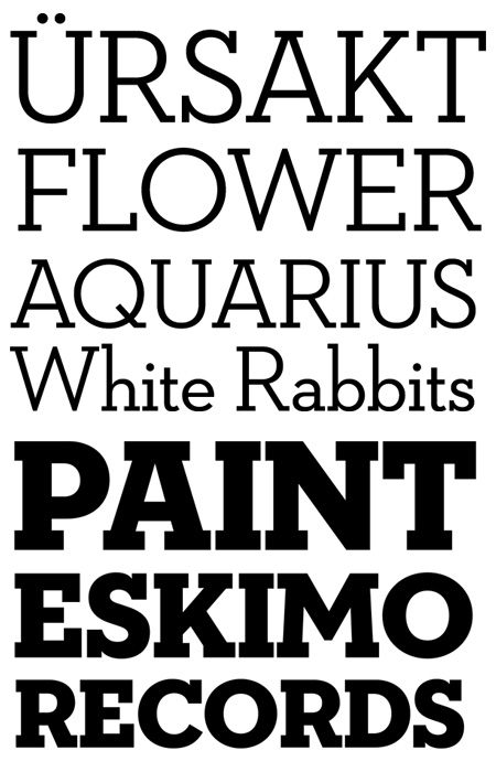
- not the most exciting specimen... damn house images ain't easy to link to http://www.houseind.…horton
- ... will admit though that any excitement about the release kinda fades in comparison to H&FJ Sentinelhorton
- skwiotsmith0
There's something I really like about this...

- But I don't know when/where/if I'd ever use it.skwiotsmith
- Eesh, r and n are particularly nasty.Scotch_Roman
- Yeah. It's far from perfect, but I think that's kind of why I like it. But I'm not totally sure.skwiotsmith
- ukit0

- Scotch_Roman0
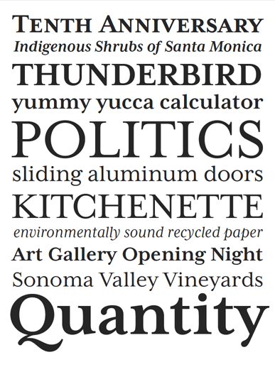
Whoa! Love the short-ranging figures feature. Kinda reminds me of a slab version of Miller. Goodbye Serifa, hello Sentinel!
- 5timuli0
- Tadam!!!!non
- Once again, H&FJ come back with an instant classic.non
- Clarendon Killer5timuli
- I think I could just use H&FJ types for the rest of my professional career.non
- < This.Scotch_Roman
- Man, that is beautiful. Clarendon killer for SURE. WANTnoRBG
- Sentinel makes me drop human seed in my undergarments, sir.janne76
- their colour palettes are also great! Def could just use their type library from now on.mirrorball
- sweeeeeeeeeeeeet!akrokdesign
- Bloody marvellous. I have it : )MrT
- Scotch_Roman0
First font purchase 2009:

Using it for an ID project right now. Love it. OSF, small caps, alternate figures... only trouble is, I have no idea which serif faces I would pair this with if I had to.
- I think it would look good with a fairly wide-stanced contempo serif... no ideas.Scotch_Roman
- Mercury's on the wide side, but too sharp to go with such a round sans.Scotch_Roman
- take a look at ff tisajimbojones
- new a bunch of people that lived on that street in minneapolis: bryant.jaylarson
- Iggyboo0
Something I am working to create a new font you can see here http://www.advertisingbrandinget…

- too many ideas in one font... calm it down a little.Amicus
- also reconsider the numbers, they are a whole different story nowjimbojones
- Andy_ssw0
- yes.styleplus
- was just going to post thisjaylarson
- loves it!joseprieto
- 5timuli0
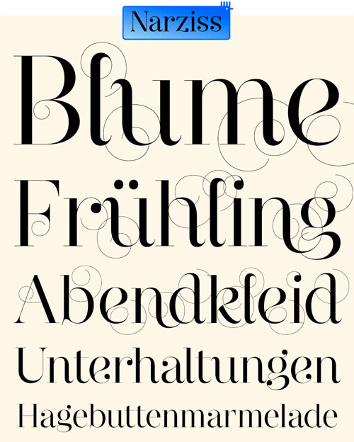
Catacumba
http://www.fountaintype.com/type…
- bastid, ya beat me. love it. 60's sexorcisto/satanicojaylarson
- shit that is fucking awesome!Ambushstudio
- I can't take all this beautybump79
- 5timuli0

- now that looks interestingkelpie
- what is that? it's rad.linearch
- Is that Trochut?
Ambushstudio - what is that?joseprieto
- 5timuli0
Looks nice:
http://www.molotro.com/ninzio.ht…
- 5timuli0
Mrs Eaves XL and... SANS! YESSSS!
"Since Mrs Eaves is one of our most popular typefaces, it's not surprising that over the years we've received many suggestions for additions to the family. The predominant top three wishes are: greater space economy; the addition of a bold italic style; and the desire to pair it with a sans design. The XL series answers these requests with a comprehensive set of new fonts including a narrow, and a companion series of Mrs Eaves Sans styles to be released soon."
- digitalN0
Helsinki by Ludwig Übele


- digitalN0
by Dan Reynolds of Linotype GmbH.

This was one of the first versions. He made some changes ever since, especially to the lowercase "l" (wasn't too crazy about that extra serif anyway) among others... http://typophile.com/node/31152
I don't think he released / named that font, but if he did and anyone here knows about it, please let me know.- This also reminds me a little bit of Latino Elongated..digitalN
- ...maybe not..digitalN
- Kobayashi: we need something to compete with Giorgio. Reynolds: me, me, pick me!jimbojones
- digitalN0
This is one of the BEST THREADS EVAH!!
- 5timuli0


- Yes.Scotch_Roman
- This is beautiful. Added to wishlist.thizzbobby


