New Improved Font Help
New Improved Font Help
- Started
- Last post
- 9 Responses
- MrOneHundred
I am looking for something like Bodoni, but maybe a little more vertically compact and perhaps a little less contrast between stroke weights.
My client has shown me a logo that they like that uses Bodoni and I don’t want to just copy it.
Any ideas? Thanks.
- gevitron0
Didot bold
- gevitron0
goudy old style
- typist0
compressed and condensed
http://www.fontbureau.com/fonts/…
- typist0
- Likey.MrOneHundred
- i like that second B and the droplet but the thins seem too thin_salisae_
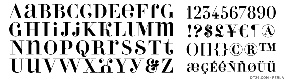
- How about that ampersand? I could eat it!MrOneHundred
- _salisae_0
andrade pro

- MrOneHundred0
Wouldn’t you know it, I left my copies of both Perla and Andrade in my other pants.
- johndiggity0
leitura display

austin

de vinne

carousel

- MrOneHundred0
Thanks friends, that’s been a huge help. I am going to mock-up with Filosofia and see what’s what from there.
