alternatives to DIN
- Started
- Last post
- 30 Responses
- jysta
Seem to be my go2 font at the moment, can't stop loving it and it's starting to annoyme. Can anyone suggest any recent alternatives that are worth the money right now?
- hallelujah0
- Some good ones in there: Klavika, Notes and Vista Sans Altsjysta
- MrOneHundred0
Pill Gothic
- the next classic?jysta
- A little cumbersome in practice usage.MrOneHundred
- But plenty of weights.MrOneHundred
- ********0
- Reallly nice but more of a helvetica substitute then DIN I'd say/jysta
- TheBlueOne0
- I always liked it,but seems to get lots of hate.TheBlueOne
- yumjevad
- It gets a lot of hate because it isn't well drawn.gramme
- The counters clog heavily as the weights get thicker.gramme
- Well, I still like the lighter weights.TheBlueOne
- It's also the font ABC uses in commercials for their shows.CyBrain
- ukit0
I'd say many fonts these day have a DIN influence.
- ********0
Trade Gothic

- johndiggity0
medina gothic

- jaylarson0
Betatype Pill Gothic, FF Unit, Fountain Malmo Sans, Thirstype Apex Sans (New), PsyOps Sophisto, Transfer Sans, Default Gothic, Faceplate Sans, Hydrous, Reform, Reykjavik One an Two, MadType Variable, GarageFonts Metroplex, Suitecase Type Fishmonger, PTL Notes
- sorry, too lazy to link images of them all.jaylarson
- your list doesn't help anyone then, does it?doesnotexist
- yeah, looking these up is pretty hard. search engines never heard of these.jaylarson
- gramme0
I've always thought DIN's lowercase letters look ungainly. The capitals seem more well-considered imho. Some alternatives:
Klavika:
http://www.processtypefoundry.co…- I second Klavika.duckofrubber
- Hermes looks nice!jysta
- love klavikaWeLoveNoise
- turk_1820
- < ITC CONDUITturk_182
- Eh, it has it's place as a display font, but not much else...duckofrubber
- WeLoveNoise0
i got tired of using din alot so decided to modify it myself and turned out really nice.
so do that
- moamoa0
Chevin

Conduit

Din 17

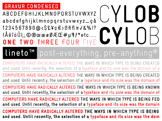
Gravur

- hey there stranger, can I buy you a drink?neue75_bold
- just used it. shh its a secret.mistermik
- its earlly, an espresso would work now... ;) sooo YES.... himoamoa
- nice to see you my friend...
here's a nespresso, tis all we have here..neue75_bold - I like the purple capsules, njammimoamoa
- Good call on all of these. Top notch, I say, top notch.ian
- its used by the UK Post Office on pretty much all their collateralitstimefortea
- Yeah liking the look of that Chevin!jysta
- Why I don't have chevin, I love it!
the rest is nice, but got em.********
- mistermik0
din17 is nice
- invisiblechamber0
conduit upper case for large font size needs.
- DaveO0
akkurat?
- SkyPoo0
I'm not telling you what my alternative to Din is. It was my gift to you all, and it was rudely thrown back in my face, like chimps flinging their faeces at the zoo.
That's faeces, not faces.


