Logos Simular to this...
- Started
- Last post
- 18 Responses
- rybo
http://imaging.lefora.com/reduce…
this font is being used everything for poor logo design post all the logos that use this font please just to prove a point to a client
- rybo0

- CALLES0
simalumaner
- dbloc0

- I always giggle at thisD_Dot
- it is pretty giggleableflyingnowhere
- mimeartist_com0
Similar, but brilliantly executed... one of my favourites...

- i.e you can be modern, but still stylish, rather than just modern :)mimeartist_com
- not one of my fav's...Amicus
- skt0

- horton0
dub brand skate gear (1995-ish) was one of the first and best examples, the looping letters actually had some meaning to it... but i can't find an example for the life of me.
- dmay0

- mikotondria30
There's really nothing wrong with that style or typeface - if you are wanting to steer your client away from the modern-for-modern-sake cliches then there are more constructive ways than just saying this element or that is OVER used..
Highlight what it is that IS modern, and how those current trends exemplify that in terms of trends in geometry, repetition, color theory etc, and get them to tell you how their brand is positioned and extrapolate this into a visual form using the current meta-trend data you just got them to agree on.
Etdc.
- WeLoveNoise0
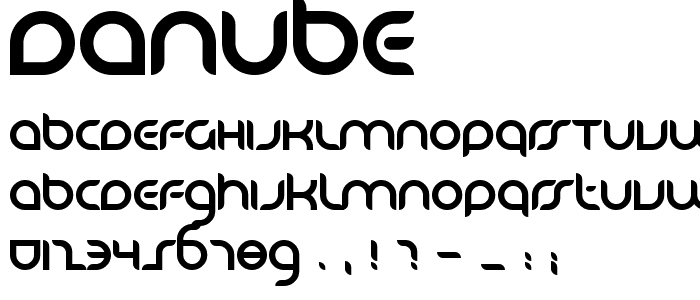
altered danube
- WeLoveNoise0
mis-read what you were asking for

- ohh man that is well shit!OhYeah
- fact - it was one of my first posts on hereWeLoveNoise
- small worldOhYeah
- i refuse to believe me and rybo think the sameWeLoveNoise
- 23kon0
its not the font that is to blame for the logos being poor!
it's the designers using the font to design shit logos that is the problem!
I'm pretty sure that font could be used for some great logos.
- WeLoveNoise0
i think the orb thing looks ok if it didnt have that grey thing in it
- slinky0

- wow, those two fonts just BELONG together don't they </sarcasm>anxiousarms
- So does the flog, just a perfect logoOhYeah


