
Thoughts / Help 99 Responses

Last post: 2 months, 1 week ago | Thread started: Sep 24, 08, 7:07 p.m.

RespondNew TopicDisable Images

  • TaylorB

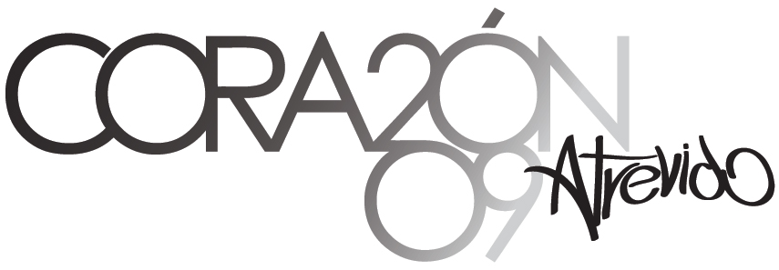
    Hey guys... I'm stuck with this logo...
    It's for a conference in Lima, Perú...
    It's called "CORAZÓN (HEART) 2009" with the subtitle of "atrevido (daring)"
    Basically, in spanish it goes like "Daring Heart"

    Now I don't like how the word "atrevido" looks... and I'm not sure how to make it work.
    I've got a creative block...

    Thoughts? Please.

    http://farm4.static.flickr.com/3182/2886679970_b91de7d8e1_o.jpg

    http://farm4.static.flickr.com/3281/2886679780_40b2e8c640_o.jpg

    Sep 24, 08, 7:07 p.m. – Permalink
  • robotron3k

    slightly smaller and track out the letters so it breaths more...

    + add note

    You must be logged in to add a note. Login now or register for an account.

    Cancel
    Dog-earSep 24, 08, 7:08 p.m. – Permalink
  • airey

    i like it. i think it works pretty well. it's obviously trying to add some urban vibe to the clinical main type and it works for me. although i do blow goats for a living so what do i know.

    what's your issue with it?

    • not sure if the word "atrevido" works written out like that...TaylorB
    + add note

    You must be logged in to add a note. Login now or register for an account.

    Cancel
    Dog-earSep 24, 08, 7:09 p.m. – Permalink
  • epete22

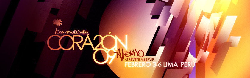
    I think I like it too: I would bring atrevido up until it stats to intersect the N but thats just me. (atrevido would be aligned with the center of 2009)

    next note >add note

    You must be logged in to add a note. Login now or register for an account.

    Cancel
    Dog-earSep 24, 08, 7:47 p.m. – Permalink
  • horton

    i'd agree with your concerns re. "atrevido" ... its not flowing for me. maybe keep scribbling it over and over until it really flows almost, without looking, that's what i do. if you don't have a tablet do it on paper with a pen, don't try and mouse it.

    next note >add note

    You must be logged in to add a note. Login now or register for an account.

    Cancel
    Dog-earSep 24, 08, 7:52 p.m. – Permalink
  • horton

    ... like the tail on the A is not flowing with the word, if this was being tagged really quick with spray or a stick that "A" horizontal would most likely loop around and become the bar on the "t"... etc etc.

    it's kinda looking like you just moused it. if you don't do freehand calligraphy well maybe consider looking at some script/urban fonts and modifying them.

    ... or ask some kid on the street to scribble it for you :)

    • my thoughts exactly... feels and looks moused (which it is...)TaylorB1/3
      try a pen and paper.. write it over and over until it flows.horton2/3
      thanks man... good insightTaylorB3/3
    next note >+ add note

    You must be logged in to add a note. Login now or register for an account.

    Cancel
    Dog-earSep 24, 08, 7:57 p.m. – Permalink
  • OSFA

    Why does atrevido have to be in that 'font'?

    I am sure you can come up with a cleaner better fitting typeface than that, it's throwing off the nice balance you have going on the title...

    • I guess it's a poor attempt at trying to capture the words expression - atrevido (daring)TaylorB
    + add note

    You must be logged in to add a note. Login now or register for an account.

    Cancel
    Dog-earSep 24, 08, 8:04 p.m. – Permalink
  • Vicentvangogh

    Suicide is always an option

    next note >+ add note

    You must be logged in to add a note. Login now or register for an account.

    Cancel
    Dog-earSep 24, 08, 9:59 p.m. – Permalink
  • TaylorB

    but then you've got the dilemma of how...
    and what font you want to use for your suicide letter...

    • comic-sans is a real scene setter.airey
    + add note

    You must be logged in to add a note. Login now or register for an account.

    Cancel
    Dog-earSep 25, 08, 12:58 a.m. – Permalink
  • fodcj

    I think it looks great especially on the actual design below the logo. As others have said if anything just space the letter a little more but other than that it is very cool.

    next note >add note

    You must be logged in to add a note. Login now or register for an account.

    Cancel
    Dog-earSep 25, 08, 1:11 a.m. – Permalink

Login or Register to respond to this

Skip to main content