font crit: union made
- Started
- Last post
- 25 Responses
- dearhead
I'm going back to a few font's i've made and am looking for a round or so of revisions before i put them up for sale... any feedback would be great..

- Koopsy0
Saw this the other day when you showed it in use on a sample sheet thing. Its a hard one to commit an opinion too becuase its very styled and theatrical, not a mainstream common use font... but I have to say I really like it and even considered asking you if you'd let me road teast it in a commercail job I have on at the moment... a book cover.
- dearhead0
wouldn't mind seeing it in the wild.. feel free to shoot an email
- Soler0
I likey
- Koopsy0
You said that three times.
I'll email you tomorrow when I'm back in the studio, otherwise you'll be discussing it with my girlfriend.
- dearhead0
fuck! internet. hate.
- 7point340
i have that disease too
- sublocked0
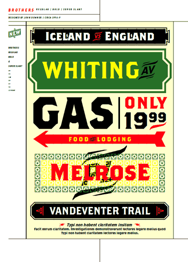
this is just crit from a graffiti artist / letter tweaker. i'm not a hardcore font designer.
not sure i'm a fan of the little dicks coming off the B, C, J, O, P, Q, S, etc...
would like to see it used somewhere to see how they match up.
- sublocked0
@dearhead
i see where you're going with those little spurs coming off the letters like i mentioned, but they don't work at all in small sizes.
they look like a bad illustrator auto-trace artifact.
i think the forms have enough character to communicate the ruggedness / industrial feeling without those added on.
i'd keep it simple and cut those down to be smaller, or non-existent. just my $0.02
- dearhead0
yeah, i think thats fair... maybe i'll make an alternate set without those? Seriously would take 40 minutes to do, and would probably just extend the typeface's value.
- dearhead0
yes, the font is similar to brothers for sure.. i actually made it because i think that brothers is way overused, and doesn't have as much character as it could.
- fair enough, suppose being over here, I've never seen anyone use Brothers... Pretty small amount of applications really...neue75_bold
- that it can be used for though.. but hey, I like what you've done so, good luck!neue75_bold
- you'd be surprised the amount of ridiculous shit it gets used for. scan a comm arts, and look for it :)dearhead
- digdre0
cool! me wants
- enjine0
i don't know much about typography (enough to know i don't know anything), but i like this font. want to send me a copy?
- play0
This is fucking dope, dearhead. good job. Kind of agree that the little spurs will get too small at small sizes though.
- gramme0
Is that Brothers next to your typeface? If so I must say you have much more work to do if you're after a quirkier alternative.
- dearhead0
brothers on the left, mine on the right.