Most Horrible Typeface
- Started
- Last post
- 34 Responses
- TDIDDY
some bad ones...Blippo Bold, Fiesta, Algerian. Blackmoor, Cartwright. Any horrible ones out there I should know about?
- utopian10
comic sans, even though "Llyod/Hedge/Bryce" love it!
- 5timuli0
I forgot

- 7point340
i abhor the lower case a in gillsans... in fact i refuse to use it because of the creator was a twisted fuck
- design_bitch0
papyrus. it's disgusting
- CALLES0
cookie

- sweet!TDIDDY
- looks like a poor man's Cooper Blackuncle_helv
- dog_opus0
Arial irks me.
- 7point340
incised 901, especially the bold faces:
http://www.myfonts.com/fonts/bit…look at the lowercase i... it's enough to make you want to rip your eyes out
- skwiotsmith0
papyrus
- Yeah, Payrus irks me too. At least you don't see it on every other website these days, thank heavens.dog_opus
- CALLES0
sand
- moamoa0
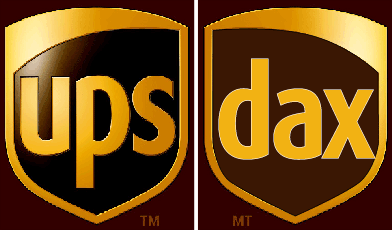
Eurostile & Dax


- Eurostile: agreed
Dax: disagreereadyok - I like both of these.dog_opus
- i like dax7point34
- i like eurostileinvisiblechamber
- Rumour has it that the agency that did the UPS logo completely ripped off Dax...skwiotsmith
- Dax roolz
I have wet dreams about dax!VectorMasked
- Eurostile: agreed
- readyok0
It is impossible to quantify the worst typeface. I think there are good typefaces and bad typefaces. It is very black and white. I will do a percentage. 98% of the free fonts you can get are all complete crap.
- readyok0
hmm...well, that is a tough question...cause I dont pay for the bad ones. Lets do this. Adobes type collection is thousands of fonts. You have to pay for the whole bundle. I would say 50% of that is crap, and 50% is usable.
- readyok0
The funny thing about some pay typefaces is, they suck ass yes...but you can find a free copy of them that sucks just as bad.
- TDIDDY0
Beanbag is crap.