Your Business Cards
Your Business Cards
- Started
- Last post
- 103 Responses
- tparsons0
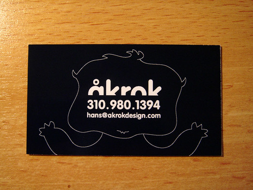
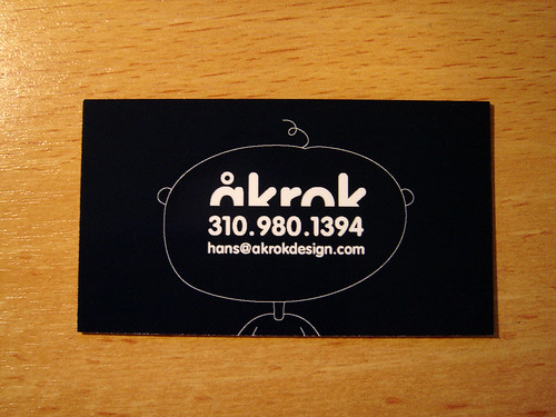
Designed for a client


- ohhh fancy. dig it.baseline_shift
- how about post that in the recent work. as its not YOUR CARD. just YOUR DESIGN.akrokdesign
- nice work though. i like it.akrokdesign
- whats the sexy type used for the bellatazza?mirrorball
- type is a little too condensed for my taste, other than that it looks cooooooool.CanHasQBN
- ********0

- it looks like you've received a lot of those cards. Go figure.********
- jaded little nancy you are.********
- hahahaha styleplus********
- someone's got their ninja boots laced a wee bit too tight today...TheBIueOne
- GO TO "GO" with out collecting the $200. lol.akrokdesign
- I want thispinkfloyd
- it looks like you've received a lot of those cards. Go figure.
- loaf0
shitty photos of my card..


- they look like the pocket tags you'd find affixed to a pair of eurotrash jeans.********
- nice illy style, ( your site)********
- looks like some fancy wodka label you pulled from some bottle********
- love your illustrations!
the logo looks great on your site, tooalicetheblue - +1 good stuff on your portfolioVectorMasked
- they look like the pocket tags you'd find affixed to a pair of eurotrash jeans.
- honest0

- My favorite so far. Steve Martin?non
- hah. centered text, not so good but it do feel personal.akrokdesign
- kodap0
a short selection from my hand-made stack (stamp on the back with info and contact) and I spare good money by giving a unique buzzy card

- juhls0

- how about some kern:ing, J.akrokdesign
- he is right, kern it babyjimbojones
- *hands cards to ak*juhls
- hah. not until you kern.akrokdesign
- thats auto kerning at its best.svenreed
- auto-not. :-)akrokdesign
- n0rty10
- that one got game. :-)akrokdesign
- awesome!! pew pew pew!baseline_shift
- utopian0

- fits easily in the wallet then.********
- you were too slow to give me your card.juhls
- nice, nice.akrokdesign
- fits easily in the wallet then.
- version30


- from last yearversion3
- nice********
- sweetakrokdesign
- groovy.airey
- akrokdesign0

- noice!ok_not_ok
- wicked.airey
- funversion3
- thanks. :-)akrokdesign
- rockingRavdyk
- Bad?********
- Excellent use of type in a funny manner! Humor with style. Nice.Brian_Piper
- mucho gracias! :-Dakrok
- svenreed0
these are great guys.
i should make one for my own lazy fucking ass someday.
- airey0

the back is 85k/70C so it's a cold deep grey with the logo varnished over the top.
- akrokdesign0
here's one more...

- version30


- opinions?version3
- yes, yes, more yes. i think ill snag this for my next card JK********
- nice idea. i hate portrait buscards but that's just me. nice idea.airey
- the rag looks a bit awkward to me, but don't know if there's a better way to solve it********
- i just kind of threw it together, the margins are all off and the line spacing needs adjustedversion3
- but as a fun idea i think it's workingversion3
- have you tried it in landscape? it will read and rag better, I think.Typosapien
- Interesting idea but client may sense your contempt for non-designers, but that's just me.Typosapien
- FTR, i would never print this card for use (at least I don't think I would)version3
- no reason not to use this card for the right clients.... although the typography needs to be more professional to work.Amicus
- ie. use Sentence Case, and a little more subdued use of colour (the yellow and green would be a bitch to read IMHO)Amicus
- I gonna steal this!!!!********
- Arrogant is the 1st word that springs to mind + the design is not great. Concept is interesting if you had a copy writer 4 the txtDancer
- insulting the potential client in the first ten minutes probably isn't a good ideascarabin
- with the proper copy & font this could be something. I had something similar regarding not working for free...sherm
- Fuck the client! Ive come to the conclusion that anyone with these answers are NOT worth working for in which case IF it offends them, you don't want to work with them anyways!nylon
- too negative. maybe better something like: hire a plumber for plumbing, a rocket scientist for rocketry, hire me for design.monNom
- mistermik0

- "Get in touch" just killed it IMO. Nicely considered card thoughDancer
- i like the 'get in touch' it personally.airey
- I like the get in touch too. Nicely considered card.Carl_Weathers
- so keep your thoughts private dancer. (see what i did there)airey
- pffft....Dancer
- its something i have always done - added a little personal / desperate touchmistermik
- shitehawke0
Bump!


