Indesign kerning Q
- Started
- Last post
- 21 Responses
- stewart
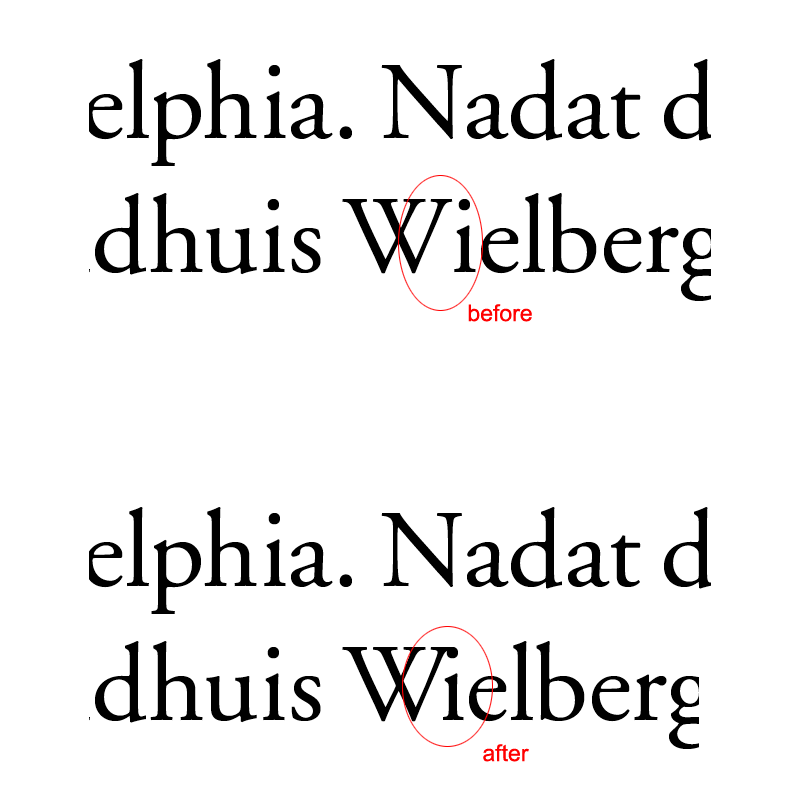
i've a very bad kerned letter combination in my indesign document: "Wi"
how can i kern this combination alone and change it in the whole document (about 300 pages).example:
- invisiblechamber0
delete i-dot?
- good one!stewart
- +1, or a little less kerning.JamesBoynton
- roundabout0
That a good question.
- tank020
you can make specialized typograms for this,
i have to ask my collegue about this,
its a bit technical...- technical. I thought so. :\roundabout
- tried this, but it doesn't work. i get the i and e stick to each other.stewart
- plus i have to change it one by one in the doc. pain in the ass because it's used 500+ times :(stewart
- check the advanced find and replace options...tank02
- invisiblechamber0
that would be a ligature. but i cannot remember seeing a Wi-ligature ever.
- BaskerviIle0
InDesign is shite for kerning. You can't change kerning tables which sucks. I like InDesign but they need to sort this out.
What the hell language is that?? ;)- the combo is not really indesign's fault.invisiblechamber
- the way they sit comes from the fonts kerning tables, but ID won't let you edit that pairing which sucksBaskerviIle
- BaskerviIle0
You could just do a find for Wi and then kern each individually, but that's not really a good solution
- JackRyan0
Could you do a find and replace with the kerned version? Could it tell the difference?
- Ranger0
set up a character style for the kerned letters and find replace with that character style?
I think Indesignsecrets did a podcast about how to do this properly a while back, you can search their site. Also I think they told you how to adjust kerning tables in InDesignCS3 may have involved a plugin - I can't remember much about it.
- doesnotexist0
how about this?
- Iggyboo0
I would suggest altering the typeface and adding an i that has a lower height for the dot. then using it to replace all of the Wi's and kerning it properly. It's either that or just use a different typeface for every capital W and lower case i. Which works too and is just as easy.
- except surely it would be, um, a different typeface? which would be weird, no?kelpie
- before altering or even replacing the font i'd definetly prefer losing the whole dot.invisiblechamber
- and it's illegal probably to alter that fontjaylarson
- stewart0
i remember kerning tables in quark 10 years ago.
not possible in indesign? i NEED to change that "Wi" combination, and not one by one. that book is about "Wielberger", so it's used a hell of a lot in this book!the language is Dutch by the way.
- neverblink0
how about writing an inDesign script that will automaticly replace all instances of Wi (dot) with Wı (no dot)? Isn't that hard to do, bit of regexp.. if you don't know how, send me an email.. kan zelfs in het Nederlands als je wilt ;)
- horton0
spell it wrong... "Weilberg".. nobody will notice.
- ha haorganic_grid
- haha..
or use |/\| instead of the W.. or 1 instead of ineverblink - ! = ipango
- love it.grunttt
- centro0
find/replace
- gramme0
That's odd. Never had this problem before. I use default metric kerning for paragraphs and optical tracking for headlines, sometimes with a little manual help. Did Quark do a better job w/ kerning? Is it actually the software or the built-in kerning table in the font that's giving you trouble?
Is that Garamond? I've never had trouble w/ kerning in the Adobe versions.
- gramme0
You know, it might help if you open up your tracking in general by about 10 points. I know what Goudy said about letterspacing type, but he's dead and we don't have exact matches for his metal type letterspacing.
- gramme0
OK here's an easy, code-free fix. Open Garamond's glyph palette. Scroll down a ways, you'll see a dotless i that's already part of the font. Make a type style and kern it in till it looks right. Presto.
- Iggyboo0
1. find all i's 2. replace all i's to a customized font that has upper and lower case i's and one is missing the damn dot in the i or it is lowered or it is another font all together. is it that hard to get an i that's similar enough to the native font your using.
- gramme0
I think my suggestion is a heck of a lot easier, and it's the correct typeface, to boot.
imho.
- stewart0
the problem is not the dot on the i, but how to change kerning tables in InDesign.