Eurostile Next WTF
- Started
- Last post
- 34 Responses
- moamoa
when did they released a new version from this ugly 90s Font? I am shocked.When I saw Eurostile for the first time, it felt like the first blain.
http://www.linotype.com/de/27078…

- ernexbcn0
I always read your nickname as moar moar
- google image "moar" with safesearch offernexbcn
- bad kerning :)moamoa
- HAHHAHHHA
HAHAHHAmoamoa - http://upload.wikime…moamoa
- http://www.dailyhaha…ali
- josimar0
I've seen pretty good uses of Eurostile (extended version at least) in the past. On Vic Reeves and Bob Mortimers show years ago it was the title font and I remember Gasbook 8 (from shift mag) used it and it looked lovely. It looks shite in your example above, but it can be nice.
- pascii0
due all respect, eurostile is a very interesting and useful font
- CphGD0
Can't see anything wrong with Eurostile...
- neue75_bold0
I think I'd go with Microgamma instead if I had to choose...

- Microgramma is Eurostyle.Josev
- "Eurostile"Josev
- the lowercase is different...neue75_bold
- invisiblechamber0
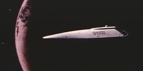
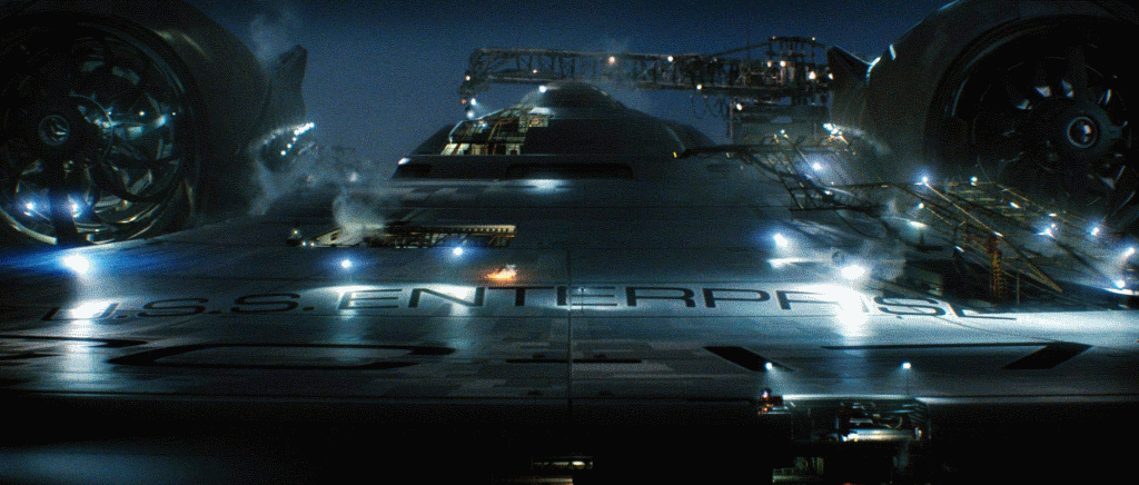
eurostile extended is a beauty. very nice when fitting with furniture and architecture, especially in 60s style. and i can't imagine a better font to write huge letters onto big spaceships ;-)
- actually I think they use avant garde http://www.bigspaces…neue75_bold
- oha.invisiblechamber
- moamoa0
↑
sorry, I totally disagree.
- kelpie0
↑
I just want to use this arrow, I have no opinion
- moamoa0
☝ nice kelpie
- kelpie0
actually I lied; I like Frutiger's condensed faces. And I love futura.
So all of you are just cunts that know fuck all about fonts and shit.
except for mike.
- neue75_bold0
☝☝☝☝☝☝☝☝☝☝☝serif gothic☝☝☝☝☝☝☝☝☝☝☝☝
- madirish0
when will they be releasing a filled version of Eurostile?
- invisiblechamber0
- thats not eurostile. looks what neue75bold said. this one is
http://www.myfonts.c…moamoa
- thats not eurostile. looks what neue75bold said. this one is
- ********0
I only use didot. for everything.
- no Trajan?madirish
- idiot?neue75_bold
- I am didiot********
- didonigramme
- didoni is nicetank02
- moamoa0
invisiblechamber are you one of those?