Logo Critique if you please...
- Started
- Last post
- 49 Responses
- Reeno0
Really caught my eye... I like it! keep the dot at the end.... nice touch.
- i_monk0
Show it, you bum.
- Dancer0
* taps foot waiting for website
:P
- mistermik0
not seeing e. or b.
change your trading name - might be easier :)
- Concrete0
Thanks everyone for your ideas and help.
Sorry to be annoying, but I have since produced something very different, which I like better. I'll post it up later...
- neverblink0
was fooling around with this..
- the one in the black square is a whole lot better than what i have seen before..9832892398
- Thanks, nverblink. I do appreciate people's opinions but I don't want my identity designed for me. :)Concrete
- And you should.. I just had some ideas that needed to come out ;)neverblink
- hehe, still better though! :P9832892398
- Good to see your constructive side come to the fore in this thread, Janne.detritus
- good one!pascii
- ian0
Ta for the nice words concrete. Hope I helped some. If your working on it today, hit us up with a revised version later on.
Oh and if nobody else has said, maybe needs a little more cowbell...
- mimeartist0
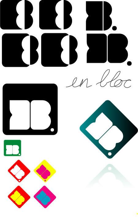
aliging the counter of the 'e' to the b is bound to make an 8...
all it says is 8 to me.
- But to be honest... does it matter... its just a marquemimeartist
- CincodeMayo0
This thread is brought to you by the letters E, D, and B and the number 8.

- i_monk0
I see B and 8; no E.
- max_prophet0
version one was better than both of these diluted soppy versions.
- next time I'll check for page 2 but my comment still standsmax_prophet
- former20
Looks great, but I can't see an "E" either.
Try pulling some of the neg space into the B, kinda like a subtle yin/yang graphic. That would help the E read more and might not destroy the form too much.
- desmo0
the E is a bit too abstract for me. tough to read.
- utopian0
This one, I like that that it breaks the grid, appears more dynamic and fluid.

- with the dot in that spot it almost feels like an 8..lifterBARON
- neue75_bold0
I like them all, but strongly advise changing your name to En Vogue and riding what's left of that ripple...
Nonsense aside, I think the first one was a winner, but let's see how it works on stationary or applications in general, as long as you're spelling out En Bloc somewhere on the same page, you could scan in a shart and call it a day...
- chaimelimeliah0
missing something, doesnt really resonate any thoughts... seems like a knockout of something missing... very chunky, really not working on many levels...
- travisbarto0
Maybe it's just me but I read it as an 8 when its on an angle like that.
- ian0
Hey conker feet.
I got the 'B' immediately but not the 'e' but I really like the original logo, its got a lot of movement in it which is good and as people have said, almost a thought bubble appearance.I think you need to refine the e to make it more legible, maybe making the two circles in the eight different sizes might help. I had a quick goo, but its rough as a badgers bollocks.

- I really like that first option.
well done, you.detritus - meh9832892398
- like 1 but keep the dot like 2. nice.Ampersanderson
- I think the 2nd one is my original. Ian I commented on this way down there V
(auto refresh, my arse)Concrete - i like ians revised one. but with the dot as before. i think someone already said this.skt
- Yup, the 2nd is concretes original (which I still like), just put her there for comparison.ian
- same - first of ian's with old dot, please.paraselene
- I really like that first option.
- eegrek0
i like it tilted as per your first one.