New BBC site designs
- Started
- Last post
- 20 Responses
- lukefry0
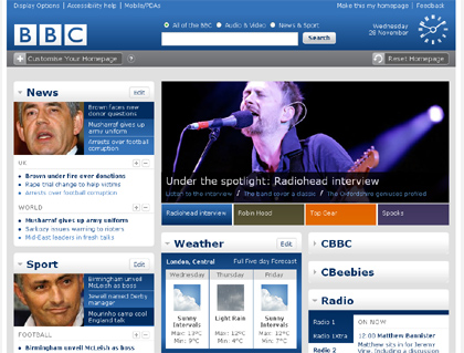
nice, im loving the clock in the top right corner..
- I'm sure the original site back in the nineties used to have a clock as well.JerseyRaindog
- JerseyRaindog0
Er, this isn't my work btw. Just posting it out of interest.
- dbloc0
I like it.
The current site looks outdated and cluttered.
http://news.bbc.co.uk
- lukefry0
where did u get this from?
- A blogger I know who works for the Beeb posted them on his Flickr.JerseyRaindog
- madirish0
whoa!
they are finally getting this rolled out??? man, anyone remember when we tried to put together an NT team to redesign this site w/ the contest they were having? I think liquid and i were the only ones who did anything...the entries though, looked like HELL.
- madirish0
found it!
http://open.bbc.co.uk/reboot/
- bulletfactory0
i like the design, but realistically, does anyone think it will still look clean and contemporary once they get all of their content crammed into the homepage?
- liquid0
hey irish... remember this


- YES!!!!
awesome you have that man!! :)madirish - i have that somewhere, but on drive i cannot find right now. : )madirish
- for those keeping score at home, this is where Jevad was supposed to pick it up... ;)madirish
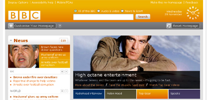
- Looks nice, but what's with the water in the header? Global warming statement?:)ukit
- What font is that in the design with the blue header? The font in the word "Africa," "Americas," etc.wrong
- ukit- the 'water image' was intended to be a video loop that would be like the roll-in to the news, much like tv..madirish
- wrong- the typeface in DIN medium, kerned -25 pxmadirish
- YES!!!!
- JerseyRaindog0
According to the blogger: "The whole site works really well (take a look at the other screen grab) and lets you move the different objects around the screen (including news, sport, blogs, TV and Radio)." Sounds neat.
- liquid0
the idea was to take some of the idea from international herald tribune... and bring it to the homepage so you can read multiple articles without leaving the page... thus the idea from the animated gif... which madirish then mocked up a comp...
- madirish0
is this site's lowest-common denominator someone with 0-60 vision?
wtf is up with the dis-proportionate scale? i would rank this about 2 years behind the CNN beta site.... that came out a year ago.
- neue75_bold0
terrible fucking widget machine...
- mimeartist0
I love the old BBC2 clock they have on there... back to when the beeb was great!
- phatlee0
Very nice... simple... love the clock!!
- madirish0
and whytheFARK is everyone having orgasms over the damn clock?!!!???
- IT IS A PRETTY CLOCK.Jaline
- it as part of the BBC 2 ident fromt he 70s: http://625.uk.com/tv…weestu
- yeah.... i know. but honestly, that is the *one* comment that holds this design together? FFS- i think this design is horrid.madirish
- Jaline0
The second one is very blue, but still more nice than usual.
- NewElpaso0
i think its a load of poo
the whole siteits FAAR too chunky - theres not enough 'value for money' in terms of space usage.
the colours under the mainstage window clash like a mother-f***
and the hierarchy is totally fudged.. by the clunkynessit looks like a piss poor imitation of a template from goodtemplates.com
-1