Show some recent work
- Started
- Last post
- 8,729 Responses
- loaf0
magazine illustrations for their top 200 ..


- really very nice!!
I'd be curious to know how you made them.dyspl - *bravo, well donemoamoa
- wow that's prettyGreedo
- loaf, I checked your site, damn you have some amazing workmoamoa
- very nice!tank02
- i will load some pics on my blog.. i actually built those damn numbers.. it took for ever.. and tons of flowersloaf
- I also checked your website after seeing these illustrations. you have some really nice stuff.dyspl
- Exquisite, Loaf! How long did you spend on it?Nairn
- 'them', rather.
I hadn't scrolled down as far as the other two. Beautiful!Nairn - I think I have seen some of your stuff on Istockphoto? v. nice stuff btw.canuck
- gorgeousADRENONLINE
- awesome!akrokdesign
- Very nice!ahalvarsson
- beautiful...neue75_bold
- wow..thanks for the + feedback..the work took about a week and a half.. about 4 different photoshoots. the store is about the rebirth of the housing industry.. bit prematureloaf
- the story is about the rebirth of the housing industry.. bit premature after this week and last..loaf
- Splendid!********
- Wow - lovely stuff loaf. And nice portfolio too.JerseyRaindog
- beautiful!poolio
- Nice! Reminds me of something you'd find in "Pushing Daisies"Jaline
- funny.. i love there art direction in that show.. one of the other ideas was actually to do bees.. 200 out of honey comb.. they did not go for it..loaf
- very nice detail********
- excellent.Jnr_Madison
- really very nice!!
- dyspl0
this thread is my all time favorite.
I wish more people would post here.
- ********0
http://www.loopkit.com, still very much in Beta. Actually it's why I popped back in to this place. To get some inspiration and a laugh or two. ^_^ Project will equal social network for audio heads, audio job boards, e-commerce system, sharing, facebook and iPhone integration.
- Hi JazX. i like this, a lot more than the old one ;)canuck
- lookin goodhallelujah
- Ah for sure.. much more stylish I suppose. You guys rubbed off on me, well not literally, but you know...********
- Ohh hi canuck, sorry yo. :)********
- looks like going to be good. way to go! :-)akrokdesign
- scarabin_net0
i wish i could post here :(
- for what reason, you can't?akrokdesign
- because he works for the movie industrie so all hush hush projects...tank02
- i see. :-)akrokdesign
- post here then:
http://www.qbn.com/t…invisiblechamber
- tank020
personal project
- tank020
More from the above project...
- Really nice Bart! Is it a font-promotion thing?neverblink
- well actually i'm making a booklet of free work, random ideas, this is about a superhero named ampersand..tank02
- promotion booklet is going to be my ny card this year...tank02
- make sure to send me one :D********
- Sandder0
onther pimpin':
- Ok, so i meant to type: another pimpin' ok?Sandder
- Laser!
PunchDouble
- dyspl0
adverts props for motogp

- nice work.akrokdesign
- nice. Lemme know if you wanna use any of my photos
http://www.flickr.co…
imnotadesigner
- JerseyRaindog0
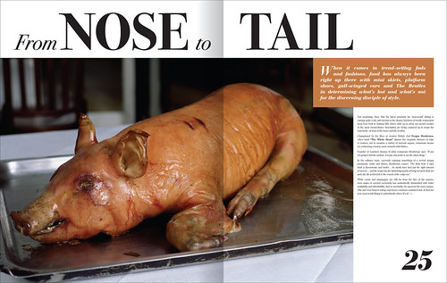
Some spreads for a new edition of a magazine I'm working on.


- Very cool!********
- Nice, Jersey!!janne76
- very nice, the left justification would need some work :) but I am sure you are working on itmoamoa
- In the SL copy moamoa?JerseyRaindog
- lookin' good. :-)akrokdesign
- SL copy is fine, mabye just 2 or 3 small things at the end. I ment the Rica copy, second blocmoamoa
- nice stuff, keep it up.sfeske
- you my friend do some nice layouting...OSFA
- Awesome!Concrete
- Very cool!
- Leigh0
- i like itcanuck
- Like it although the actual site has a handwritten font, which I like too!uncle_helv
- last minute client change.Leigh
- *bravoooo I like!!! very...moamoa
- Very neat.JerseyRaindog
- very nice!janne76
- lovely..neue75_bold
- excellentyJnr_Madison
- uncle_helv0
Is it wrong that I'm viewing this thread with images disabled??!
- Leigh0
work in progress..... Interactive video for Eurostar.

- Looks neat, would like to see a functional version when you're done.canuck
- Cool Leigh.JerseyRaindog
- wow, functionality looks complex but nicely integrated..!!janne76
- looks goodJnr_Madison
- Leigh0
- me & Tom Butler worked on thisLeigh
- excellentmoamoa
- lovely as usual leigh********
- v. nicehallelujah
- btw, it's Tom Butler and I!! ;)OSFA
- very nice tho!OSFA
- Northern talk mate.Leigh
- nice work there. :-)akrokdesign
- great.Jnr_Madison
- dyspl0
still working on it. I think I will go for the 1st one and develop it a bit more.

- hey, that's really nice stuff - your own font, I take it? Good job! I prefer #2, if you care - I'm sure i'm the only one.Nairn
- thanks. yep my own fonts. and yes I pay attention to your feedback :)dyspl
- I like 2 and 5 most.JerseyRaindog
- nice :)moamoa
- the l is so damn prominent, but you can't make it thinner, can you? or just visually it'd be better...janne76
- i meant lower case Ljanne76
- yes #2 connects the 'Li' to the 'ttle' - plus I always like ligatures :)neverblink
- LC is in the house. heh.
...nice work.akrokdesign - thanks for the feedback&advices. I will def try a thinner version (should help to get the l less proeminent).dyspl
- Cabein0
pencil and photoshop
Soon to be a large silk print

- kelpie0
have had to sneak this out furtively in work in the last hour for my friends gig he's putting on (on my birthday! yayay!), as I am without home computer these days :( Go on, rip my type to bits you bastards ;D

- i quite like it, bar the obviously lazy throwing in of ornaments into the corner.********
- Would be better witha full ornate border no?********
- probably aye, I would have given it a bit more thought without our new studio manager trying to catch me out the whole time ;)kelpie
- no color? your cheap bastard! lol.akrokdesign
- No bad for a quickie kelpie.JerseyRaindog
- That's what all his women say...
*bum-tschinng!*Nairn
- i quite like it, bar the obviously lazy throwing in of ornaments into the corner.
- ********0
OK the real reason I came back here: http://www.loopkit.com/registrat…
Verbiage and layout still need some work, but the overall shape is there. It's an e-commerce CMS that will enable us to upload original sound files and enable users to share them, etc. Hopefully, we will allow users to embed audio objects into other sites much the same as what YouTube! does. As well as support iPhone, Android and facebook. Worth a shot.
- Alignment's a little severe?Nairn
- Also, your front page as-is assumes that I know what Loopkit is. I don't.Nairn
- Nairn, it's all screwed up. The CMS isn't allowing us to align things properly. Needs a ton of work.********
- Exactly, the front page needs some Web 2.0 verbiage. "We do loops" or something simple. Agreed.********
- Does this work for your browser? http://www.loopkit.c… does it slide?********
- F*ck, you have to click on it from the site itself. Oi!********
- cls0
Working on some sort of smoked out alphabet.

- cool, burn oneJG_LB
- Even if I'm smoked out I can't be scoped out
I'm too ill, I represent Park Hill
See my face on the twenty dollar bill
Cash it in, and get ten dollars back
The fat LP with Cappachino on the wax
Pass it in your think, put valve up to twelve
Put all the other LP's back on the shelf
And smoke a blunt, and dial 9-1-7
1-6-0-4-9-3-11
And you could get long dick hip-hop affection
Allways have to think about the cappadonna bit from Winte Warz, one of my all time favouritescls - to much text for this piece of sitecls
- My friend Jakob has done something similar http://www.formconsp…Leigh
- Click 'Formconspiracy Illustration'Leigh
- nice work from your friendcls
- I like that clsuncle_helv
- if you like playing with 3d, fumeFX makes nice smoke effects.
dyspl - Thanks uncle_helv, and displ will have a look at fumeFX but this one is all photoshop no 3d involved.cls
- niceskser
- Really cool. Or hot. You decide.5timuli
- JerseyRaindog0
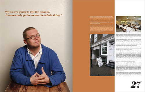
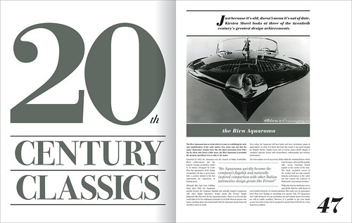
Revised those Less magazine spreads slightly and some other finished spreads.

- In my opinion, the pagination is little to bgig comared to the content text, otherwise, nice. I like the rest, looks class, and 'rustgevend'********
- Fair comment digdre. It's a personal taste thing. The actual page size is closer to A3 so everything is deliberately big.JerseyRaindog
- In my opinion, the pagination is little to bgig comared to the content text, otherwise, nice. I like the rest, looks class, and 'rustgevend'


