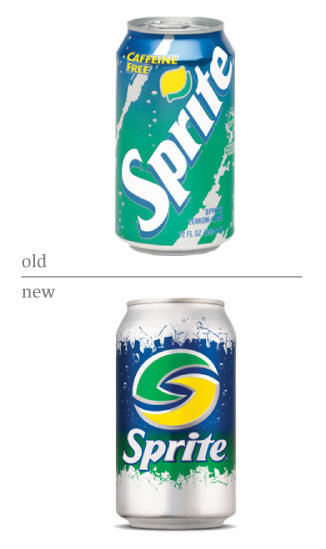
Sprite Rebrand
- Started
- Last post
- 42 Responses
- Baskerville
The type on the new Sprite rebrand has to be the worst example of letterforms on the face of the earth:
how did it get past the hundreds of people who must have approved it?
- Baskerville0
look at that p and the r and t, ow they're all horrible.
- Mimio0
Amen, Baskerville, they look like medieval weaponry.
- Sven_sk0
ugh. thats horrible. how do so many rebrands go so horribly wrong?
and its odd that they usually go wrong when they rebrand is to make the brand look more "extreme and edgy and all x-games" which is a look i think is getting REALLY tired.
- grown-sexy0
A brand as big as sprite never makes such mistakes. The designers are all from the to shelf, naturally. If you fail to see the beauty of this type, the problem is you
- Baskerville0
A brand as big as sprite never makes such mistakes. The designers are all from the to shelf, naturally. If you fail to see the beauty of this type, the problem is you
grown-sexy
(Jun 12 06, 09:01)lol
- grown-sexy0
hint: the logo vs. the type
- robotron3k0
it's hip, it's urban, it's sprite!
- Baskerville0
I have no problem with the logo, it's just the type that's horrible. Compare it to before which is much better.
- kyl30
so who did it, landor or something?
- kelpie0
it's hip, it's urban, it's shite!
robotron3k
(Jun 12 06, 09:02)
- kyl30
http://www.veer.com/products/gal…
maybe they're on to something?
- Nac_part20
not bad...just reminds me of the pepsi logo a bit..
- Mimio0
lol, not bad? it looks like two blades...not exactly the kind of feeling you want to evoke for a beverage now is it?
- johndiggity0
why is this "urban"?
- ximeraLabs0
Its Sprite for the 1998 Cyber Generation!
- version30
i see a lymon (half lemon, half lime) with an S seperating the 2
It's current, its techy, its fot the youth
I think it works even if it doesn't massage the egos of most graphic designers
- dbloc0
what is this?
- pski0
- dbloc0
same logo?

