Band Logo Crit
- Started
- Last post
- 26 Responses
- asprin
http://www.tsegadinka.com/projec…
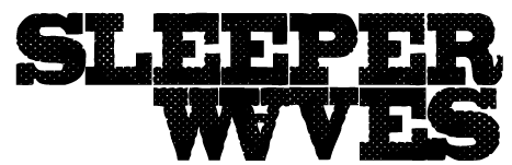
Band's name is Sleeper Waves... Folky sleepy tunes that drone a bit
- designaked0
Like the idea but the font doesn't do it for me. The balance isn't there yet.
- mg330
Ditto on the font. A border like that really calls for a serif font, don't you think?
- mg330
BTW - what is the technical name for that type of ornamentation in the border? Was looking for stuff like that recently but didn't even know what to search for.
- mandomafioso0
I second the serif font idea. I've been all about flourishes recently though so I dig that part.
I think those flowery things would be called ornaments or flourishes.
- ross0
i like the type.
id lose the oranamental stuff though... a little played out...
- ross0
i only say that cause i used it a couple of years ago, and now regret it...
- cassilicious0
The first thing I thought of when I saw the shapes of the middle curvy borders was....boobs.
- rasko40
looks like something I would expect to see on the little soaps you get in cheap hotels. Flourishes are lame and it just looks like a lazy way out. And anyway, the balance between the flourishes and the type is way off.
- level2b0
I agree, that border will be stuck in 2005. The antique floral thing was cool while it lasted..
- mg330
Without flourishes, you're left with nothing but paint drips!
- dirtydesign0
I'm feeling the type, not the floral border though.
- asprin0
haha...this is not a psychological test...no boobs. :)
I appreciate the suggestions for using a serif font. I will play with that and see what results I may get.
In using the font I did, I was looking to create a sort of imbalance and tension that I noticed in their music and lyrics. The font was a result of Futura Medium ... turned into outline and then path offset by -.05 inches...
Althogh the ornamental stuff tends to be overused, I think in this instance it will be longer lasting
- asprin0
More anti - flourish post... I'll take your suggestions into consideration.
Here was the first one I did for them but they weren't digging it
- mg330
If you want imbalance and tension...
Go with Comic Sans.
- mg330
asprin,
The second ones you posted are way better. I like big letters, stuff that lends well to stencils.
- level2b0
How about a wave in the shape of a sleeping bag. Done.
- horton0
i like the 2nd jpg/ old stuff a lot more than the flourishes. as everyone has been saying, the flourish thing is very played out.
only thing is why the backwards "E" and flipped "A".. seems unnecessary. don't rely on that old design crutch unless it has purpose.
- asprin0
My first porposal is still my favorite but one of the band members thought it looked too 'eastern bloc / communist' style so we had to move from that.
"only thing is why the backwards "E" and flipped "A".. seems unnecessary. don't rely on that old design crutch unless it has purpose."r
The reasons for the backwards E and flipped A was more visual than anything related to the name.
The flipped A helped continue the heavy slab serifs of the W V and E and matched up better with the E that's above it. The backward E on the other hand could go..
- horton0
heh... it's the flipped "A" that really bothers me.. hard to read and leaves that nasty space between the "AV".
but that's just me.
as for the band thinking the font is too communist, that's your job not theirs, and they obviously have no idea what they're talking about.
to me a slab serif actually suits thier sound as you described it.
- gruntt0
slap the band guy that didn't like the 2nd one... and then go with that.
nice work (on the 2nd, i didn't care for the first... overdone).