Modern Sans Serif Typefaces
- Started
- Last post
- 64 Responses
- moondog0
dang. that foundry monoline is swoonworthy.
sigh
*takes out credit card
- Solid0
I'm likin' that Aaux Pro ..
- lele0
Also FontFont "Kievit"
Clean and simple but with good details.
- vburo0
check the fonts you wanted thread. i posted fedra there yesterday.
- delilah0
din is everywhere. EVERYwhere... on every book, magazine and product i pick up. including our office walls.
that's the prob when a font is go-ood- overexposure, and then it's not cool to like it any more.
- TheTick0
I'm having an allergic reaction to Din the last week. I really liked it the first time I saw it and now - I just cringe. In a few years it'll be like "Din? Oh that's so 2005..."
It almost makes me want to use Helvetica..
- rabattski0
"... and then it's not cool to like it any more." - delilah
assuming you see fonts as fashion.
see there are these discussions regularly. people saying you can't use font x or y anymore because everyone uses them and it's not "cool" anymore to use them.
wrong thinking.
it's what you do with it and not what you use. you shouldn't be dictated by trends, you should dictated by the job and the ideas in your head, anything what it acquires to execute it good and do a job well done.
and if it takes din to get the job done then it'll be din. if a design looks wicked with din than i bet you're not gonna say: the design sucks because it has din.
now i agree there are font trends and people jump on these bandwagons and just use din because it's hip to use but it's the execution what counts.
- lele0
Totla agreement.
- boiconet0
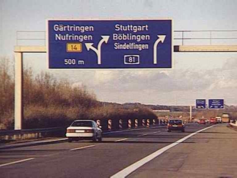
It's wierd going to Berlin and seeing DIN on street signs and stuff. I'll see if I can find a pic...
- rabattski0
just berlin?
what about entire germany.
din = deutsche industrie norm.
it's on the highways.
it's everywhere.
it's german.
- rabattski0

and so on and on and on.
only germans have the right to say they've seen too much din schrift. :)
- boiconet0
It's..er... nice though. The English road sign font is wierd. I downloaded a template that I've been trying to turn into a font for a while now. It's not nearly as clean.
I liked this one in Holland:

I'm a big ol' type tourist. ;)
- TheTick0
You know, it's more that ceratin artistic expressions - music, fonts, word usage, etc. - are timeless and others define a certain time. The ones that are timeless - love 'em or hate 'em - will stick around forever. The ones that define a time will still carry import but peg themselves to a certain time or event. You cannot escape that dragline that comes with it.
DIN to me, despite it's everyday usage in Germany, just strikes me a s something that will just get pegged to this period. It's not to transcending, like Helvetica can be. Din to me is a RESPONSE to the overtly clean helvetica like typefaces - someone looking for something that is just like helvetica, but with more funk or something. I just don'r see it becoming a transcending classic in terms of usage.
- boiconet0
Yeh, it's like Helvetica was Neue Hass Grotesk once. Everything has got it's roots, it's still a shame when people forget these things though.
- rabattski0
whoah. you're totally missing the point. din was never intended to be a transcending classic or a response to helvetica. it was never intended for "design" purposes.
from linotype:
"DIN stands for Deutsche Industrienorm, German Industrial Standard. In 1936 the German Standard Committee settled upon DIN 1451 as the standard font for the areas of technology, traffic, administration and business. The Committee chose a sans serif font because of its legibility and because its forms are also easy to write. This font was not foreseen for advertisements and other 'artistically oriented uses' and there were disagreements about its aesthetic qualities. Nevertheless, DIN font was seen everywhere in Germany, on signs for towns and traffic, and hence made its way into advertisements because of its ease of recognition."
- boiconet0
Are designer's using DIN very much in Germany?
- rabattski0
oh and although it says deutsche industrie norm, the font has been actually made by the dutch guy albert jan pool (he worked in germany though).
- rabattski0
i've never noticed a din trend in germany. i think din, as well as vag, are fonts that are more popular outside germany.