Logo for self
- Started
- Last post
- 9 Responses
- Chip
Hey all,
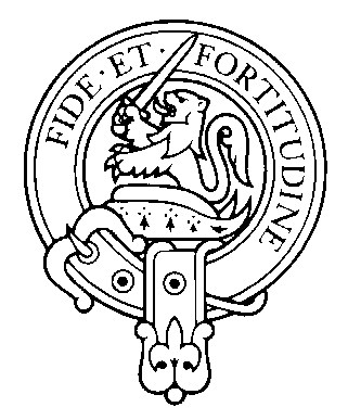
I'm thinking of making a logo for myself using my family crest (lions and swords and stuff) I'll draw in illustrator and give it that "old" grungy type of "stamped" look and feel.
Before I start, does this sound like:
a) a great idea
or
b) a stupid tacky waste of timeSimply answer a or b and I'll get your first thoughts which is what I want...
cheers !
- brundlefly0
A.
- abizzyman0
neither - somewhere just below A... but no where near B --
... if A were 12 inches away from B (i'm a yank - CM's aren't in my vocab)... I'd say that i'm about a 1/4inch below A.
make it and post it.
- XC010
A.
- jox0
It's secret answer C.
c) being "nice, but very over-used"
- abizzyman0
mmhmm.. yep... well put jox... i was thinking the same thing - just couldn't come up with words.
Crests in general - especially when used with that LAME-ASS PEICE OF SHIT OLD ENGLISH FONT are a bit tired.
... but.. you didn't say you'd use that font... so... do it.
- Chip0
thats folks, good comments.
I did think about the overused thing, the other option for logo was country flag. ie the george cross. (union jack is way too used)I'm looking at the crest now and seeing what happens...
fanks all.
- shant0
BBBBBBBBBBBBBBBBBBBBBBBBBBBBBBBB...
- madillness0
B (i'm english, ii see that crap all the time)
forget the heraldry stuff, go for the convenience store name tags, with stars and a "call me scooter" vibe.
- stimuli0
It's mine!