Logo of the Day
Logo of the Day
Out of context: Reply #790
- Started
- Last post
- 820 Responses
- milfhunter1
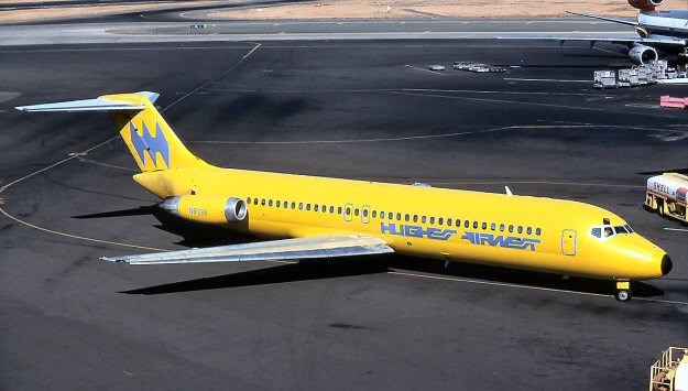
Hughes Airwest by Mario Zamparelli
- wow, that's....shitscruffics
- You are shitmilfhunter
- what scruffics saidoey_oey
- what milfhunter saidoey_oey
- what oey_oey saidIanbolton
- what Ianbolton saidutopian
- I can’t unsee the Batman logo on the tail wing.Green_Pork
- I kind of dig it. It’s like when AI is trying to make letters but they come out all gibberish. A brand before its time.monNom
- what they saiddee-dubs
- The Hughest, the biggliest, the airwest.
— RonNairn - what utopian saidKrassy
- Slight Wipeout vibe(s).ideaist
- I think this was great back in the day and it looks kind of cool now. Or everyone's just biting the style from that era now._niko
- Feels over designed — a bit of cleanup and it would work better. But good luck with that word mark at small sizes/pixels.evilpeacock
- there were no smaller sizes/pixels in the late 60's they didn't even have to worry about yo fax! lol_niko
- there is not a way in which this is NOT shitscruffics
- what Krassy saidsted
- WIPEOUTcrazyprick
- If batman did a hostile takeover of QFC.garbage
- Late 60's small sizes = heavy dot gain killing fine details.evilpeacock
- What yurimon saidmaquito
- Na, i likes it, 4 realzmaquito
- If you said to me that it was made in 2001, I would have believed itdrgs
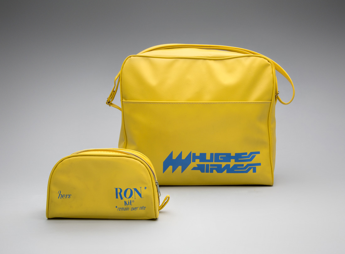
- What I don't get here is the bat symbol on the back of the plane is not the same logo as on the larger yellow bag and the smaller yellow bag is the same colorsCyBrainX
- ...but completely different type and logo.CyBrainX
- That is ass that makes the shit, nice swedish colors thoughAQUTE
- that looks bananapango
- Highest Air Wet?sab
- AirwolfCalderone2000
- This is neither WipeOut or particularly good.MrT