Pentagram Sucks...
Pentagram Sucks...
Out of context: Reply #175
- Started
- Last post
- 189 Responses
- i_monk2
- very cool!Krassy
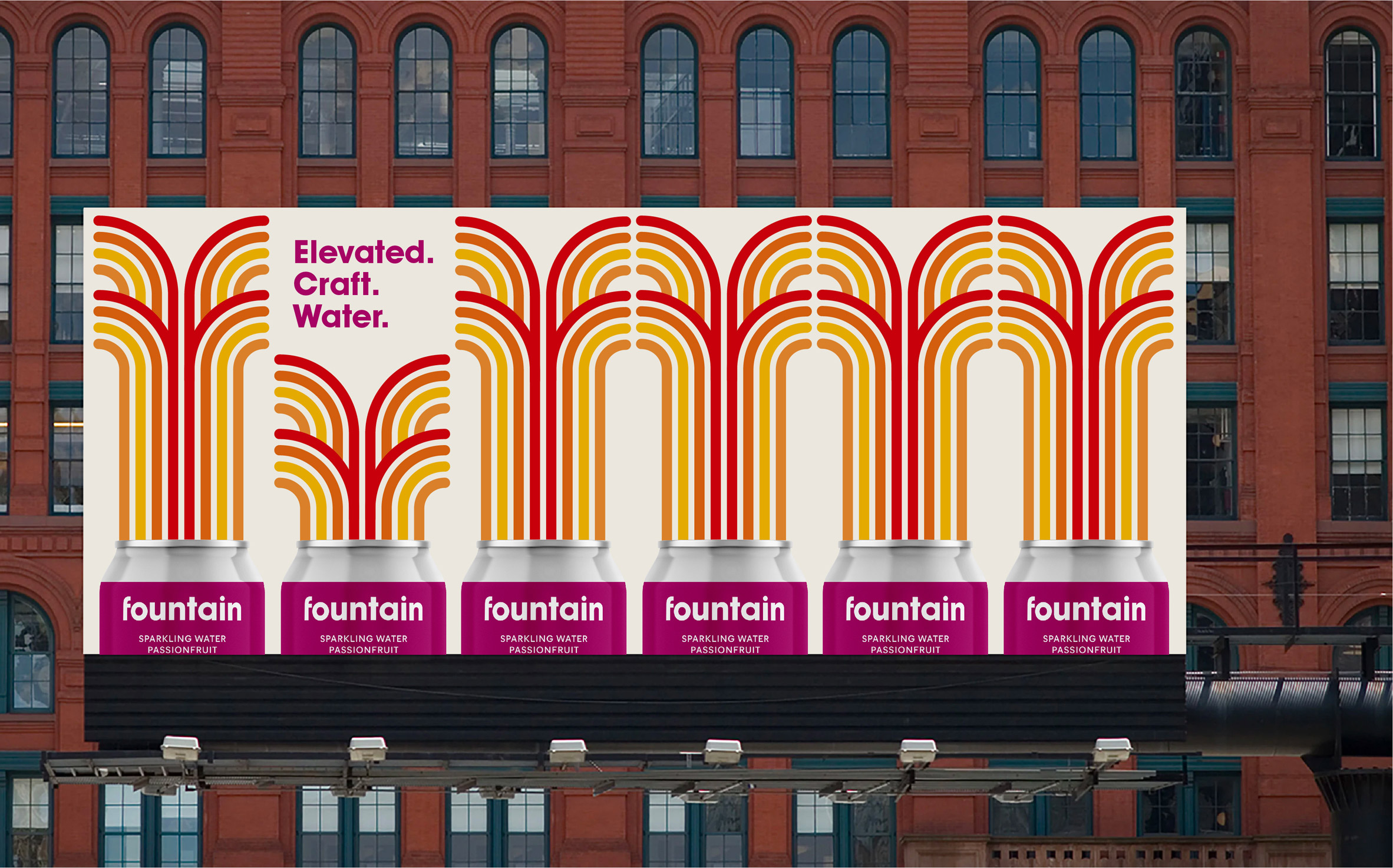
- The mark is very nice, on the other hand the font looks out of place. Why didn't they use a san serif rounded font to compliment and integrate the mark?utopian
- ^ I wondered that too. Surely they considered rounded fonts though, so maybe it was too beaucoup?MondoMorphic
- This looks horrible, imho. I am far from a font expert, but that looks amateurish to me. Why the inconsistency?formed
- The Yellow Submarine (presumably) fountains look fun enough.formed
- The colors in the billboard bother me a lot, now that I know that this logo & brand are about water...a poor choice of colors.utopian
- Billboard looks like something I want to clean my bathroom with if I'm in england and stuck using the store brand.monNom
- I think the mark is quite nice, but I'm pretty sure this plague was sent down to rid the world of ridiculousness like "craft water"monNom