first world problems
Out of context: Reply #1429
- Started
- Last post
- 1,620 Responses
- nb2
^ Oh man, I know this feeling. I've bought a couple books online that have driven me nuts.
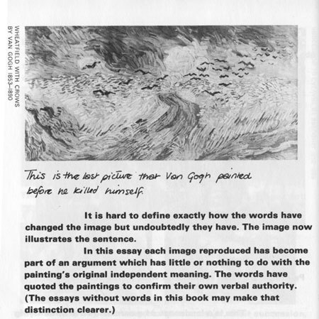
This edition of Ways Of Seeing by Berger is set with some kind of extra bold sans-serif, that looks like the font included in some old dot matrix printer. The book is supposed to be amazing, but I can't get through it because it's so tiring to read.
Another one is Believing is Seeing by Errol Morris. Great content in the book and the copy inside looks great at first glance, but once you start reading it's so frustrating. I think Pentagram did it! Come on, dudes, I bought this book for READING.
I sometimes wonder if book designers are thinking, "Ah, if they actually wanted to read this book, they'd buy the eBook. Let's just make the book look good on the shelf, we'll sell more."