Thoughts on the Wired.com Updated?
Thoughts on the Wired.com Updated?
Out of context: Reply #3
- Started
- Last post
- 13 Responses
- jtb260
I've never particularly like Wired's site. I never seemed drawn into the articles in the same way I do on sites like The Verge. Just as an observation for myself (your experience may vary) this new site has kept me on it a bit longer and I've found stuff I wanted to read a bit more easily.
I think the headlines are attrocious:
All caps, condensed, varied weight characters with delicate serifs. A trifecta of illegibility.On the other hand:
http://cl.ly/image/391r3Y0C0E19
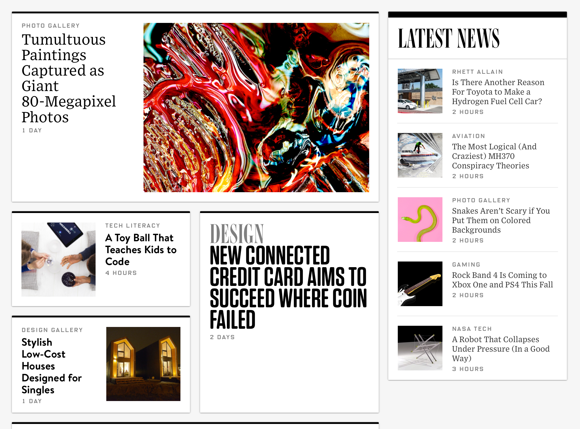
I find this an absolute treat to read, and since this is the bulk of the experience I'd say at least in that regard this is pretty succesful. I'd maybe have chose something a little less harsh that pure black on stark white for reading, but I can always tune down the brightness on my monitor I guess.Dig this as a browsing experience:
But jesus... pick a typeface.