Show some recent work
Show some recent work
Out of context: Reply #5285
- Started
- Last post
- 8,595 Responses
- tank020
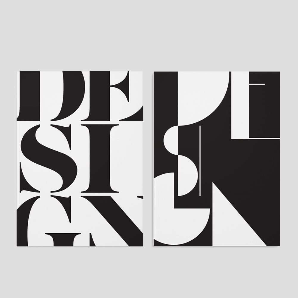
2 covers for a Belgian magazine for their design issue.
The concept is that design is a language that has different accents.
The underlying visual idea is about eliminating elements to look
for the border between readable and not readible.
The first cover will be a wrap around the second. At least that's what they promised ;)