Show some recent work
Show some recent work
Out of context: Reply #1035
- Started
- Last post
- 8,593 Responses
- JerseyRaindog0
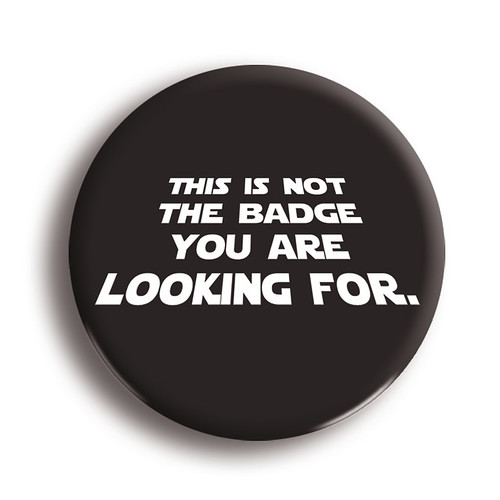
Working on getting this up and ready for production.
- Nice idea, but I think it needs adjustment. I think the text needs to fill the badge, maybe bleed off at the bottom line and be shallower in the perspective.Wolfboy
- looks cool, not a fan of the 'k' on the bottom line, I keep thinking it's a full stop inbetween the k and the iAkiraprise