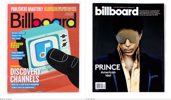
Billboard Redesign
Billboard Redesign
- Started
- Last post
- 29 Responses
- hans_glib0
very pentagram
- desmo0
Mmm... meaty.
- detritus0
cui bono?
- marindsgn0
meh
- twokids0
this was necessary, why?
- Continuity0
1) Select text object in Illustrator
2) Select bold version of typeface in Character drop-down
3) ?????
4) PROFIT- Don't forget change the 'B' to lowercase. Then send invoice for $250kETM
- Oh yes, too right.
My god, I've got cynical.Continuity
- desmo0
I wonder how much money was spent on this
- ukit20
It's a very <strong>bold</strong> redesign
- Fuzziest0
Extra $50k for changing the tittle on the 'i' from square to circular.
- monospaced0
the r d space driving me nuts
- dbloc0
Bill Bored
- qTime0
Its been "completely redrawn" to be very similar
- monospaced0

- yeah, i know it's not the right fontmonospaced
- was just thinking thatdbloc
- i_monk0
Why was my post deleted? I demand an answer!
- hektor9110
I agree with the logo. But, I really like the editorial sections.
- monNom0
now it looks like every other magazine. success!
- canoe0
Armin Vit - what a boring child.

