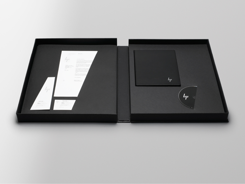
HP New logo
- Started
- Last post
- 41 Responses
- OBBTKN
Discuss...
- inteliboy0
- looks kind of like it could be bp rather than hp....
vaxorcist - I like it, a bit alien style but cool, that's their goal, to be les nerds...MrPierre
- or liji
ArsenicPants - looks like it was designed for hard-core gamers, not corporate IT dept weenies...vaxorcist
- looks kind of like it could be bp rather than hp....
- uan0

- ORAZAL0
http://www.movingbrands.com/?cat…
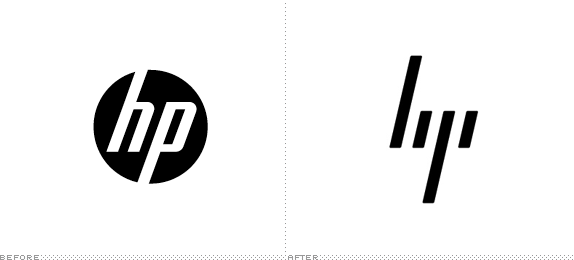
We have removed the HP case study per the request of HP, in order to clarify the distinction between the aspects of the work that were setting a creative vision for the brand but were not implemented in the market, and the aspects which reflect the actual in-market applications of the Identity and Design System. The ‘Progress mark’ logo is not the go-forward direction for HP.
Please bare with us whilst we update the case study and thank you for your support.
- animatedgif0
oooops looks like everyone took this a lot more seriously than it was actually intended to be.
I like the new mark but it seems to be going in the opposite direction of the actual company which isn't leaning forward at all but instead is curling up in a fetal position around a printer in a pool of toner.
- AVAVA0
I liked the Human Progress concept, quite clever.
However the hp mark doesn't quite work, the rounded edges keep leading me to read it as 'bp'...something not quite right.
- stewdio0
MIT Press

- honest0
For some reason, I can see this in it:

- feel0
well, i've been doing stuff for HP, not that I love the old blue sphere logo, and like inteliboy said this is forgettable, but i think is easier to work and to animate :D the old logo you'd be locked with that spherical stuff and the font inside.
- benfal990
yeah, Liji is a good company. I like'em. This is the logo of Liji, right?
- loool0
now this guy has to make another couple of seconds in his animation
- rosskemp0
Oh, I came for this
- vaxorcist0
why?
everyone remembers the old logo....
the new one looks like they hollowed out the company, left only the vertical parts... oh, maybe that's true.... given recent developments
- BaskerviIle0
I think there are some really elegant thoughts in their work for HP. I realise HP may not ever go for the final futuristic mark (which I like, although think needs tightening).
What I really take out of this project is Moving Brands' flair for self promotion. They have a knack of making great videos that really sum up the process so well. Without the strategy, long-term thinking and process branding is just straight graphic design.
Their added value comes from all these things. That's something that makes me want to work at an agency like MB. They've realised that if you don't publicise the academic, strategic parts of branding and have a stance or opinion, then you're not worth much.
Most big brand agencies don't do this yet, and they all should, because we all go through these processes on every project, MB are just smart enough to publicise this
- feel0
fontfabric did an entire type face just for fun
http://twitter.com/#!/fontfabric…
- feel0

- i_monk0
Normally I love minimalism like this, but the descender of the P gives the whole thing a negative feeling. Flipped over and dropping. Not a good thing.
- BaskerviIle0
Dolce and Gabana should flip the new logo upside down and use it:

- Looks like a FU sign to me...nbq
- Dairy Queentimeless
- dairy queenok_not_ok
- i see a fingerjohnny_wobble