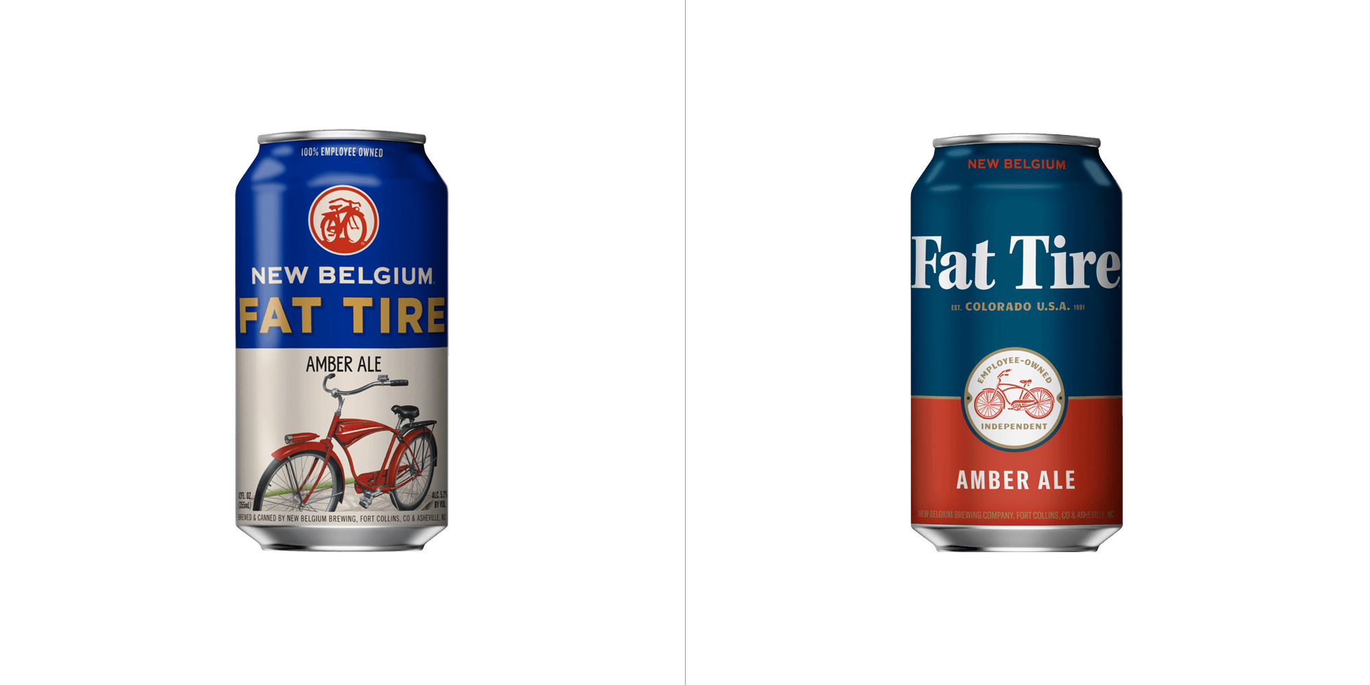
Fat Tire Logo
- Started
- Last post
- 17 Responses
- monospaced0
It's like the norm core of design.
- colin_s0
awful
- milfhunter0
both ugly
- shapesalad0
shouldn't it be more of a bubble font style, that has a 'deflated' look. hand drawn of course. then some hipster bicycle drawings stuff around it, duotone in back ground.
Or have some funny illustration of a cyclist with a flat tire enjoying a beer while his team mates race past.
It's just lacking a narrative, a charm, it's just legible text with a picture of a bicycle in conservative dull colours.
- having the word 'flat' in the name of a beer - you got have balls, confidence, swagger in your design to counter that connotation.shapesalad
- it's Fat not Flatdbloc
- davey_g0
Saw this in the liquor store, did not have the same classic feel. Not that the first version is utterly fantastic, but it's got the CO vibe and the biking roots its stemmed from. The new version is a little too fancy.
- utopian1
On both the cans and bottle the logo does not even fit without rotating the entire bottle/can.
- monospaced0
That typeface choice is unfortunate.
- It's very legible, I'll give it that. But it kinda messes up what could be a balanced design.monospaced
- fooler1
when I lived in Colorado we called it "Flat" tire. So many other better brews, Although their Ranger IPA isn't bad.
I do like the bike and can design better but the new font lock up (if you can call that a logo) bugs me. I like the old San Sarif better.
- ideaist0
Detailed bike becomes illustrative bike.
One day, it will once again become detailed bike.
Death.
Repeat.
- capn_ron0
old one. it had pizazz, panoche, pinche cabron.
- imbecile1
old is better
- Gnash1
which is the new one?
- jaylarson1
boring beer, decent new logo
- freedom0
I like the old better but it bugs me on both how wide the logo is.
- sarahfailin3
Looks like it's running for president.
- dbloc
thoughts?