Explain this Grid?
- Started
- Last post
- 12 Responses
- GeorgesII0
pentagram suck thread #839,
--------------------------------...
yo mate what is up with you and pentagram,
I've never seen someone so dedicated in criticizing an agency he never (do you?) worked for.btw, did you learn how to nicely align left?
- ohhhhhsnap0
Nice. Bloomberg has Illustrator3.
- If you can't critique design. WTF are you in this field for? UR dead.ohhhhhsnap
- sublocked0
PWNED BY THE BLUE ONE
- designquestions0
Still think the arrows look funny.
- utopian0
FFS these signs are impossibru to understand.
<------FAIL------>
- TheBlueOne0
"Why left align everything?...I don't mind it. But I'm curious the rationale behind it."
Seriously, what's with you young kids today. How fucking hard is it to actually read the goddamn link you posted? Anyone under the age of thirty doesn't even fucking read today. It's right there. In the link. You posted. You know, if you read the page.
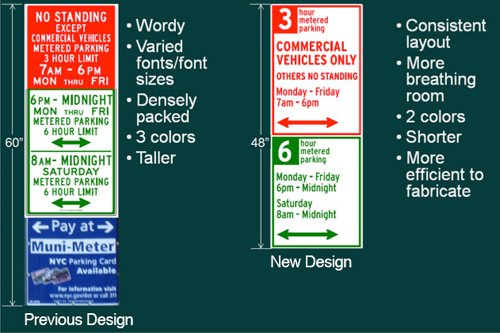
"The existing signs were densely packed with information that was wordy and hard to follow. Typography was centered and set in all caps in various fonts and sizes, making it difficult for the eye to scan. Messages were stacked on different placards in various combinations up to 60″ high, with restrictions for commercial vehicles in red and passenger vehicles in green joined by additional signs in blue reminding drivers to pay at the Muni-Meter....
The new design introduces a consistent, simplified layout that cuts back on the number of words and colors and adds some much-needed white space. The signs are divided into two sections, one for commercial vehicles (still in red), the other for passenger vehicles (in green). The number of hours parking is allowed is prominently placed in a reversed-out box at the top left of the sign. Everything is aligned to the left, and typography appears in both upper and lower case, set in a uniform font, Highway, widely used in US DOT signage. The superfluous blue signs have been eliminated altogether."
There's more paragraphs detailing EXACTLY why they decided to left align everything. It's right there. IN YOUR FUCKING LINK. In words.
And the first link IN THE ARTICLE goes to the NYC DOT site where they explain the thinking behind it:
http://www.nyc.gov/html/dot/html…
It even has a picture:
*throws up hand, gives up on millenial generation
Go back to your twittering or whatever it is you kids do today
- albums0
People read left to right where these signs are placed.
- detritus0
It looks good.
You're highly over-rating graphic design's place in the world.
Give in, you will eventually anyway.
- designquestions0
I don't mind it. But I'm curious the rationale behind it. Surely someone in the approval meeting thought the arrows should be centred / extended.
The green signs have so much white space.
- 23kon0
would you prefer centre (or 'center' if you are in the US) or right aligned? :P
- designquestions0
They don't compensate for the interior stroke either.


