WHY?
- Started
- Last post
- 18 Responses
- ********
Why is HP using this ugly hand-drawn looking font? They used it on this Total Care logo and on the touchsmart ads. Yuck

- ********0
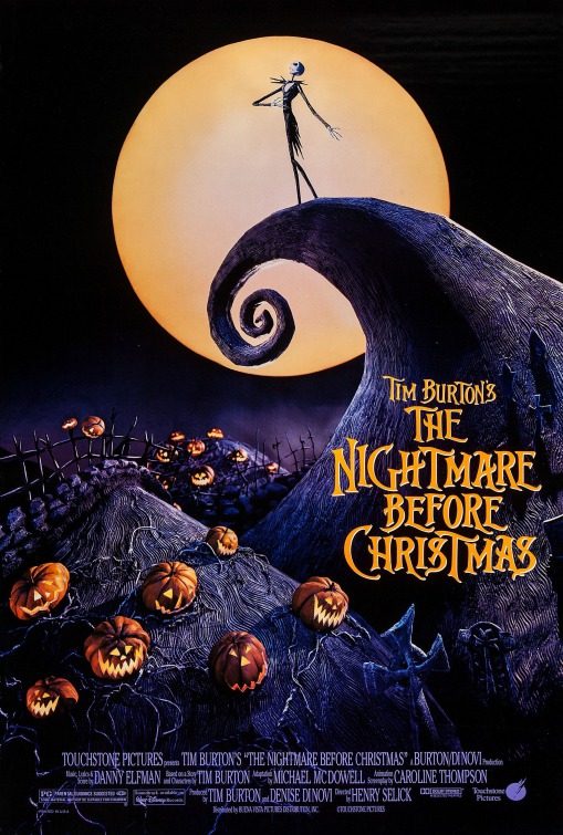
it looks like tim burton shit. when i saw the touchsmart stuff on their site i was like "what the hell is this an out of date halloween site?"
- ********0
They're trying to appear "young".
- nothingbutnet0
It's working. I like it.
- BuddhaHat0
I know what you mean and I thought that the first time I saw it plastered all over their main page, but in limited use it works for me (possibly because of the Burton-esque styling to it :)
- kkills0
and...is that futura? the fonts, combined with these colors, make me want to vom.
- boobs0
Ummm. Refresh my memory: has HP ever done anything interesting, or even good, design-wise?
- horton0
i like it.
hands, care, human touch, diy... all that and suitable i think
and who teh fuck are you saying "tim burton shit"... ? pffft.
- horton0
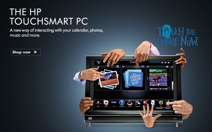
- mmm, so handsy.
not.kkills - Tim Burton AND the addams family. some scary shit.krisscott21
- mmm, so handsy.
- ukit0
It's hideous. And these are some of the better looking examples I've seen.
- chukkaphob0
It reminded me of some nice Tim Burton posters (where it actually WORKS!)
- ukit0

- horton0
isn't this hands/font thing maybe playing off a retro murder-mystery film posters or something?
- horton0
ah yes:
http://www.nationalpost.com/news…
It employs the same font on the front of Everything Is Illuminated (Houghton Mifflin) and incorporates an identical hand motif to the one on Extremely Loud & Incredibly Close (Houghton Mifflin), the author's follow-up book.

- so according to that article.. just "inspired by" and a throw back to similar styles by S.Bass and P.Randhorton
- scarabin_net0
it's willy wonka
- airey0
it always reminds me of the work done on this film.

- Corvo20
lol @ tim burton shit.

